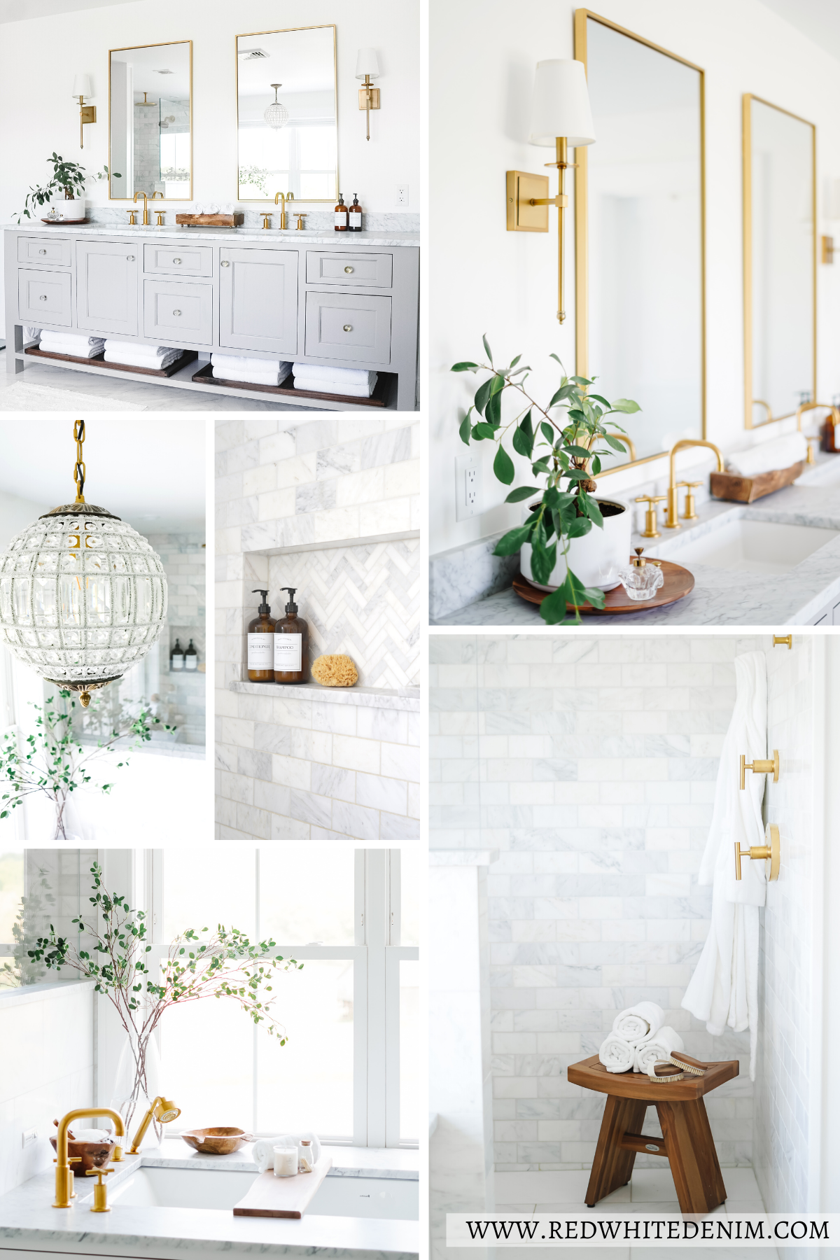
I’m so excited to finally share our PRIMARY BATHROOM with you! This room is one of my favorites in the house, my little oasis. When we designed this room I had a spa in mind – neutral colors, minimal decor, white towels and natural accents. We chose our favorite Carrera marble for the floors, shower and countertops. I wanted a space that was simple, soothing, and relaxing and that’s exactly what we created!
Keep scrolling for a full tour of our marble bathroom including links, measurements and sources to everything.
MARBLE BATHROOM DECOR + DESIGN
FINISHES
All the walls and trim in the primary bathroom are painted Benjamin Moore Chantilly Lace. The floors are done in Statuary marble tiles. Statuary marble is from the Carrara region of Italy. It looks similar to Carrara marble but is typically a much brighter white with less veining. The veins are dark grey providing a beautiful contrast to the very white background. We chose a 12″ x 24″ tile so that the floors wouldn’t look too busy. We extended these floor tiles into our walk-in shower as well.
SHOWER
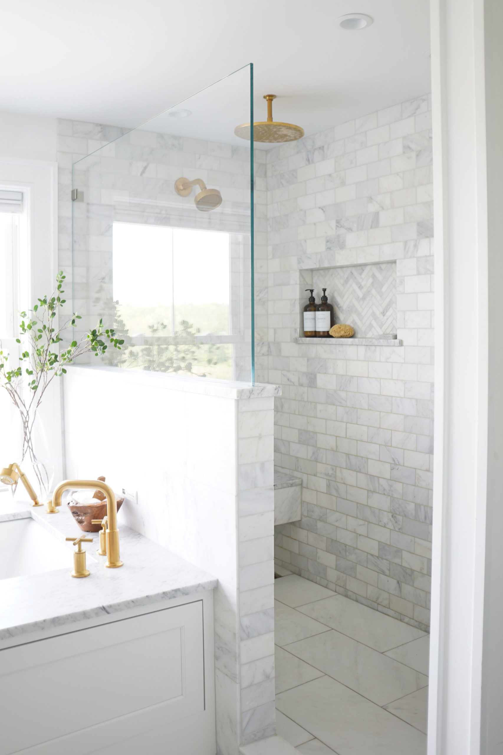
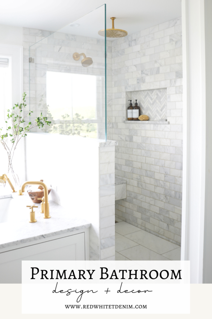
We love the look of a marble bathroom and wanted to extend that material into our shower. We went with a custom design that changed several times throughout the building process – this was not the original design! Once we saw our bathroom framed, we decided to expand the square footage of our shower and eliminate the door. Creating a walk-in shower was one of the best decisions we made! The more open design makes the shower feel so much larger and brighter. For those wondering…no, it doesn’t get cold when you’re in there! Note that we have a shower head AND a rain head, so you’re always getting hit with warm water. We also placed both shower heads on the opposite side of the shower, furthest away from the opening. The design worked out perfectly!
We used 3″ x 6″ subway tiles in a mix of Carrara and Calcutta marbles which blends well with the Statuary marble floor tile. The Calcutta tiles in the shower bring in a bit a warmth and is also a great complement to the gold fixtures. We finished off the 1/2 shower wall a single piece of glass.
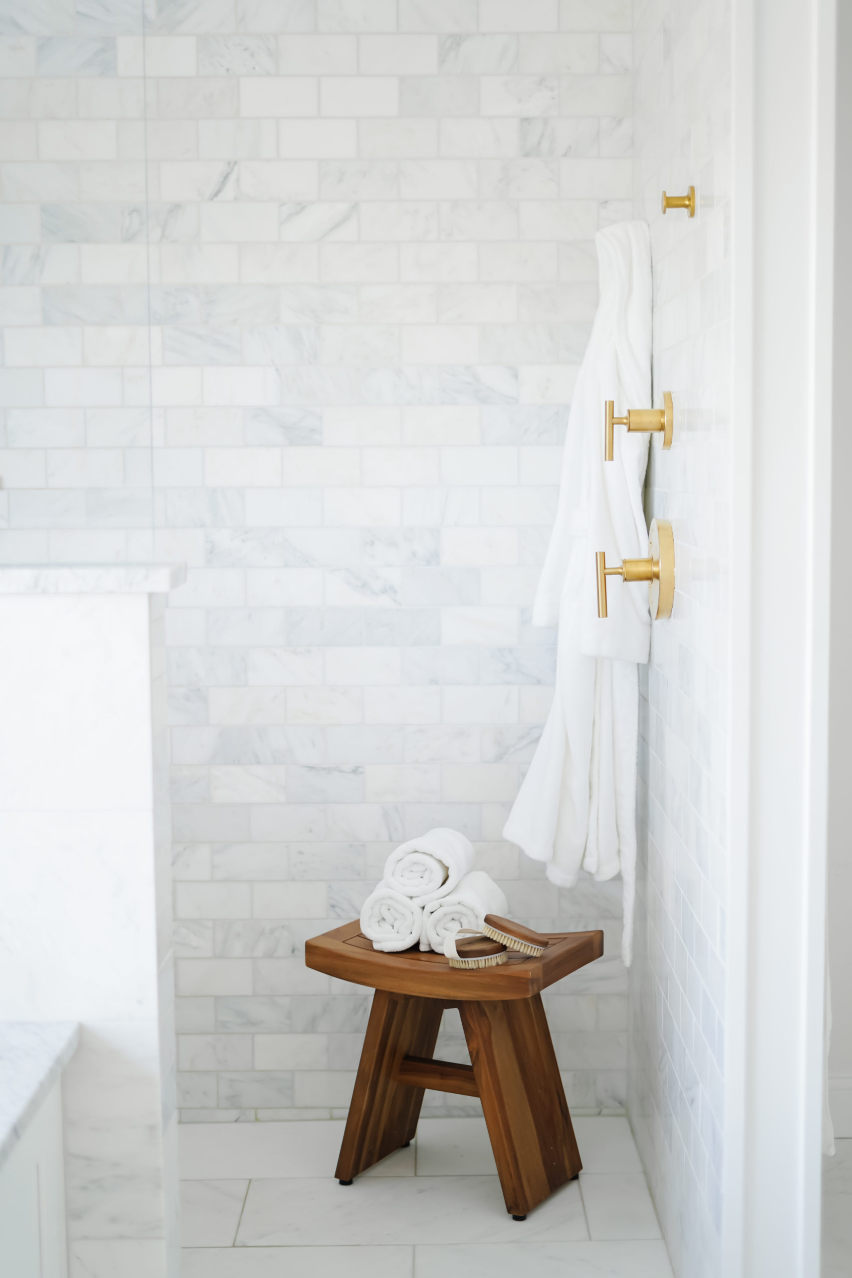
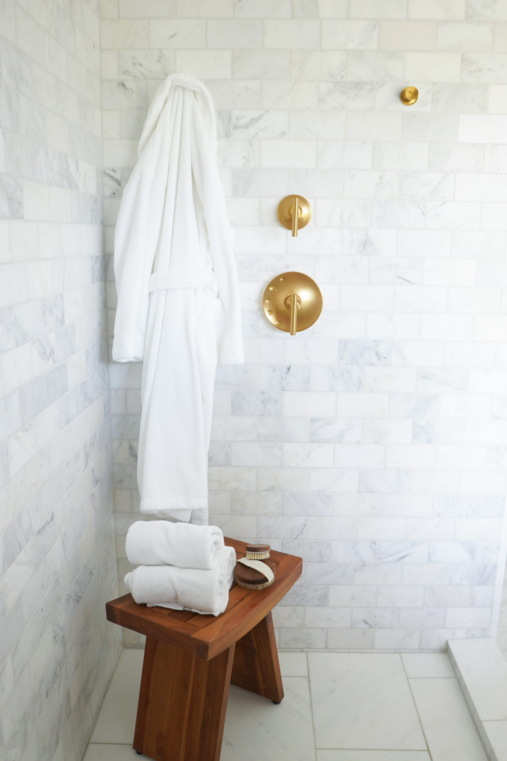
All shower fixtures – Shower Trim, Rain Head, Robe Hooks – are by Kohler in the finish vibrant moderne brushed gold. One of the best decisions we made in the shower was to include 2 robe hooks built right into the shower wall. We use these every single day. It’s so convenient having a spot to hang your towels inside the shower, so you can easily grab them when you’re ready to get out. Also a great spot for hanging your robe for shower accessories.
– CLICK/TAP TO SHOP-
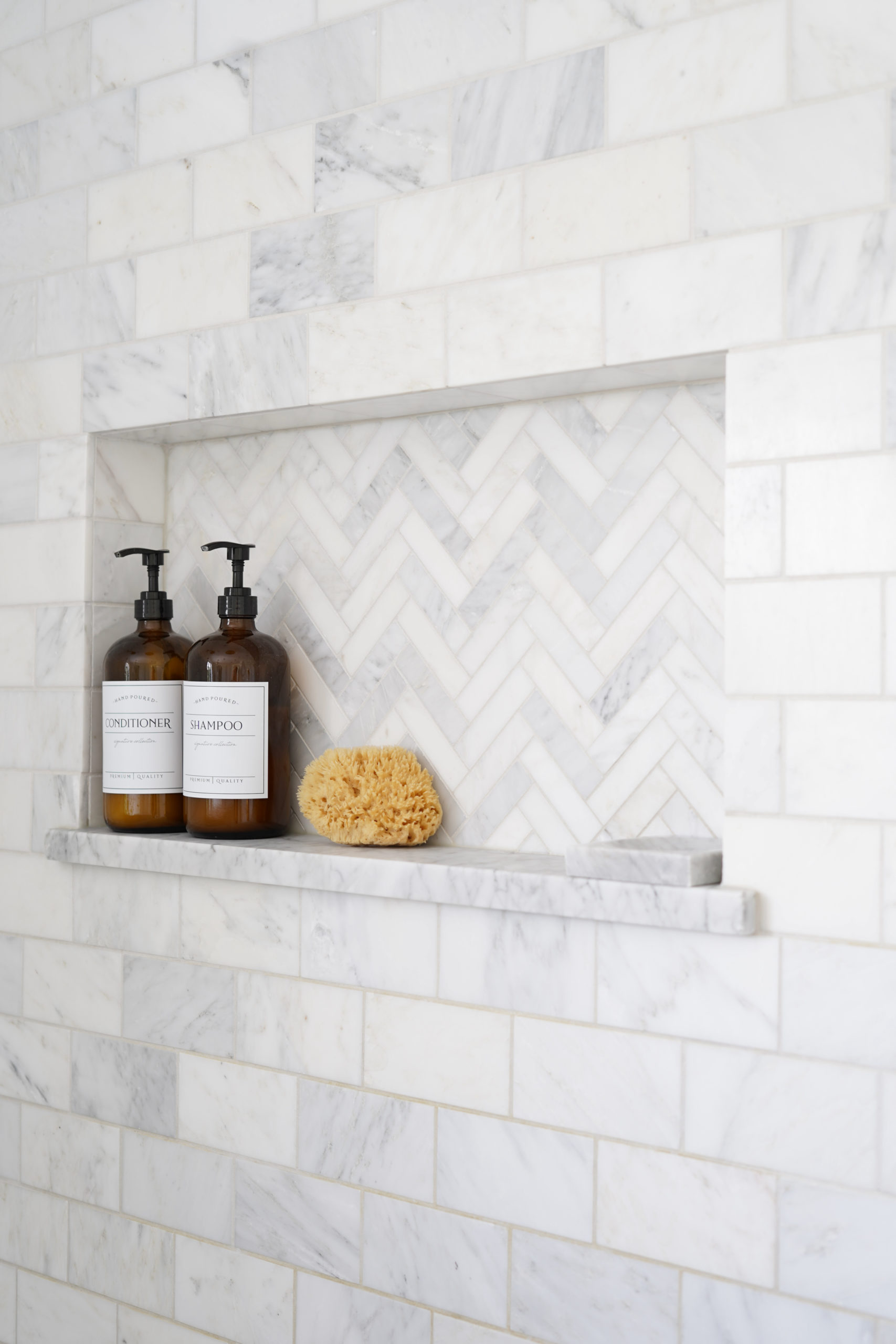
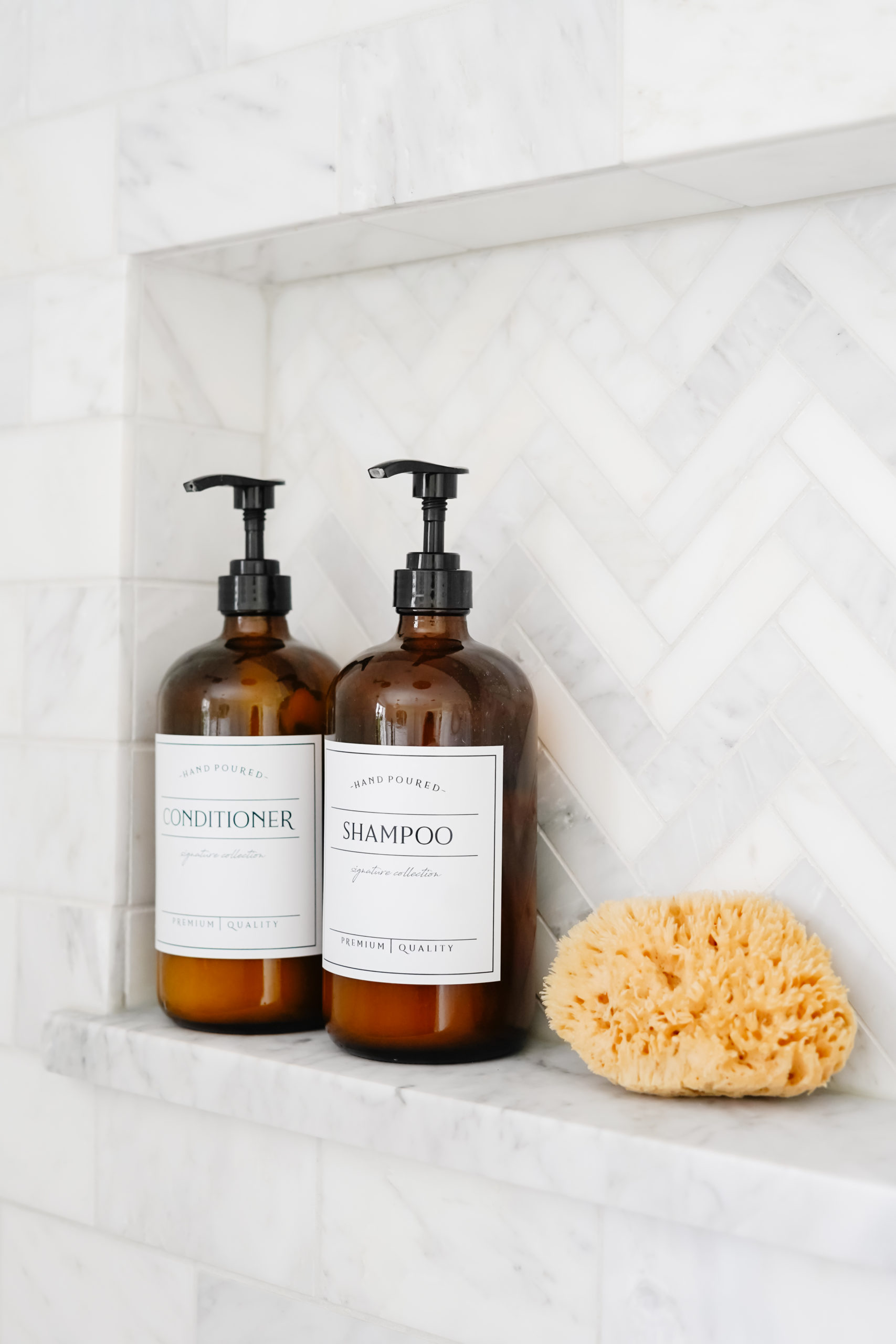
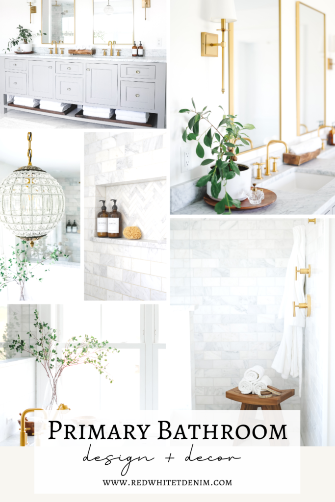
We chose a small herringbone tile to line the inside of our shower niche in matching Carrara/Calcutta mix. Amber glass bottles are used to hold some of our toiletries helping to keep things looking cohesive and organized. These bottles come in multiple sizes and labels are custom.
– CLICK/TAP TO SHOP-
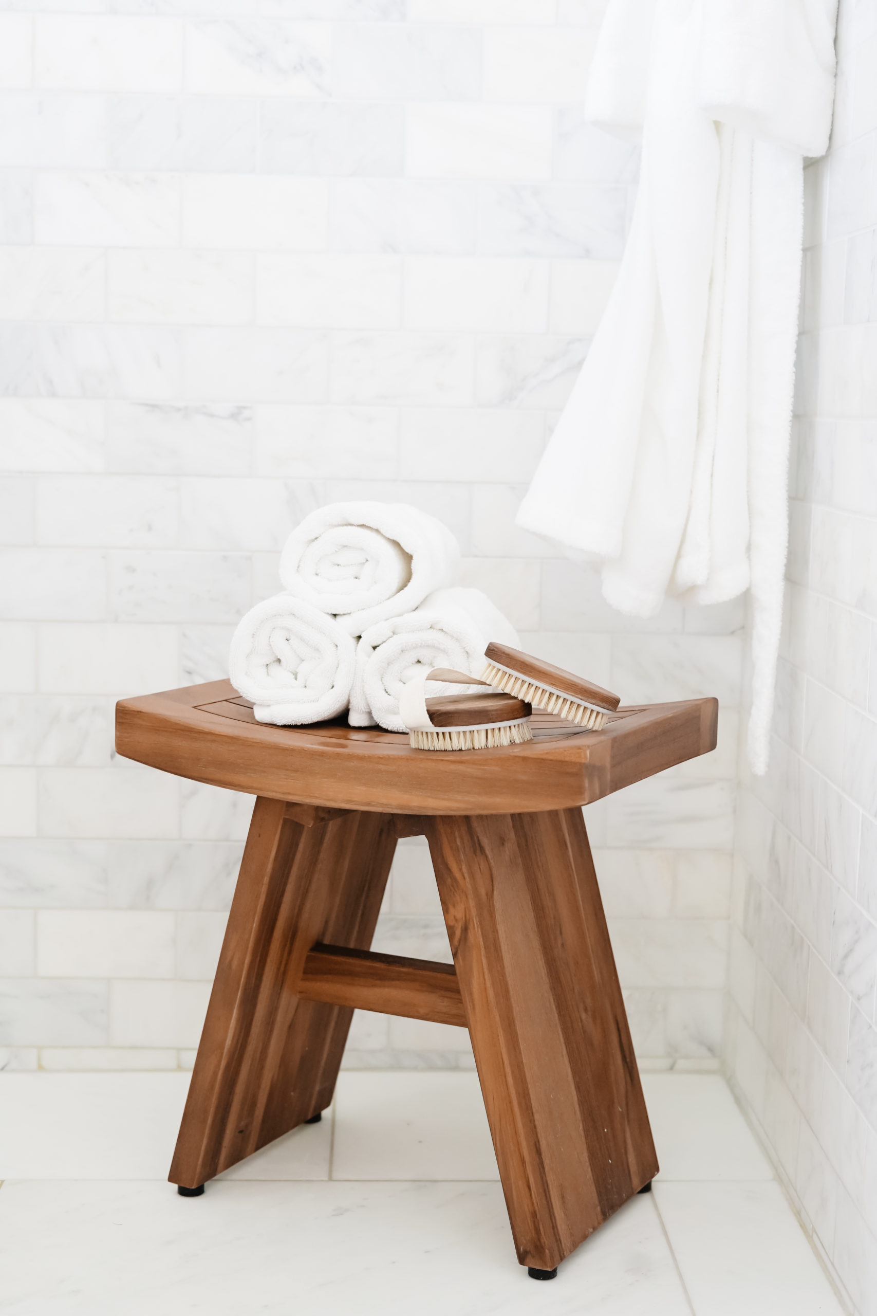
This TEAK SHOWER BENCH is an Amazon find! I wanted to add something to the corner of the shower for extra towels, dry brush, shower sponges, etc. This bench is made off teak so completely waterproof and perfect for a shower! I love decorating with functional pieces that double as decor. This bench also gives the space a very spa-like feel!
– CLICK/TAP TO SHOP-
TUB
We went back and forth over what style tub to use in our primary bathroom for months! I love the look of a free-standing tub, but a built-in tub seemed much more functional. As someone who takes baths weekly, I’m all about function and comfort over style! We ended up going with an under-mount air tub by Bain Ultra. I love that the under-mount style gives a nice flush look with the Carrara marble surround. The size of our tub is 31 x 62 with a 61″ x 83″ surround.

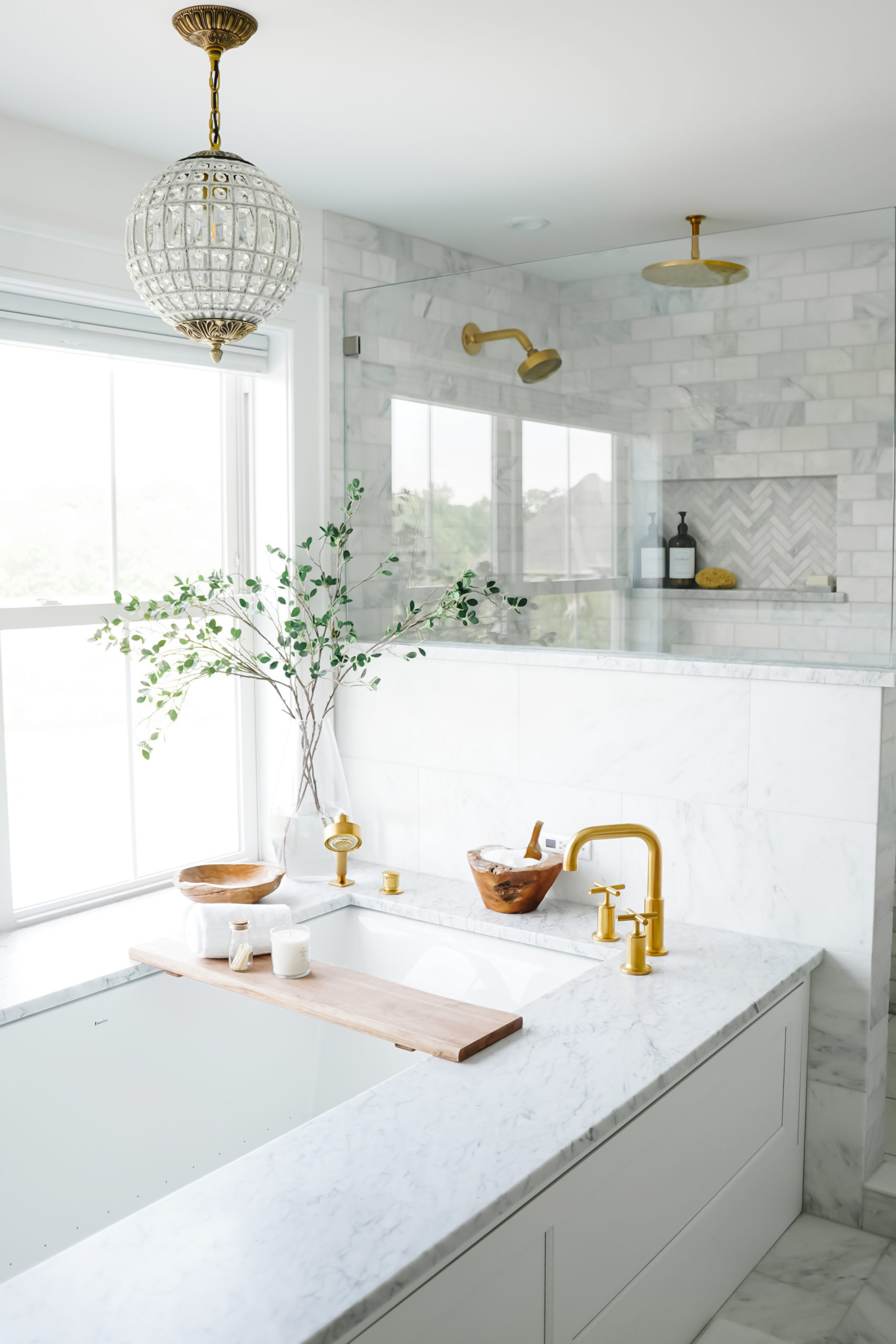
The TUB FAUCET hardware is by Kohler in the finish vibrant moderne brushed gold to match the rest of the fixtures in this space. I love the mix of warm gold hardware with the bright white marble.
– CLICK/TAP TO SHOP-
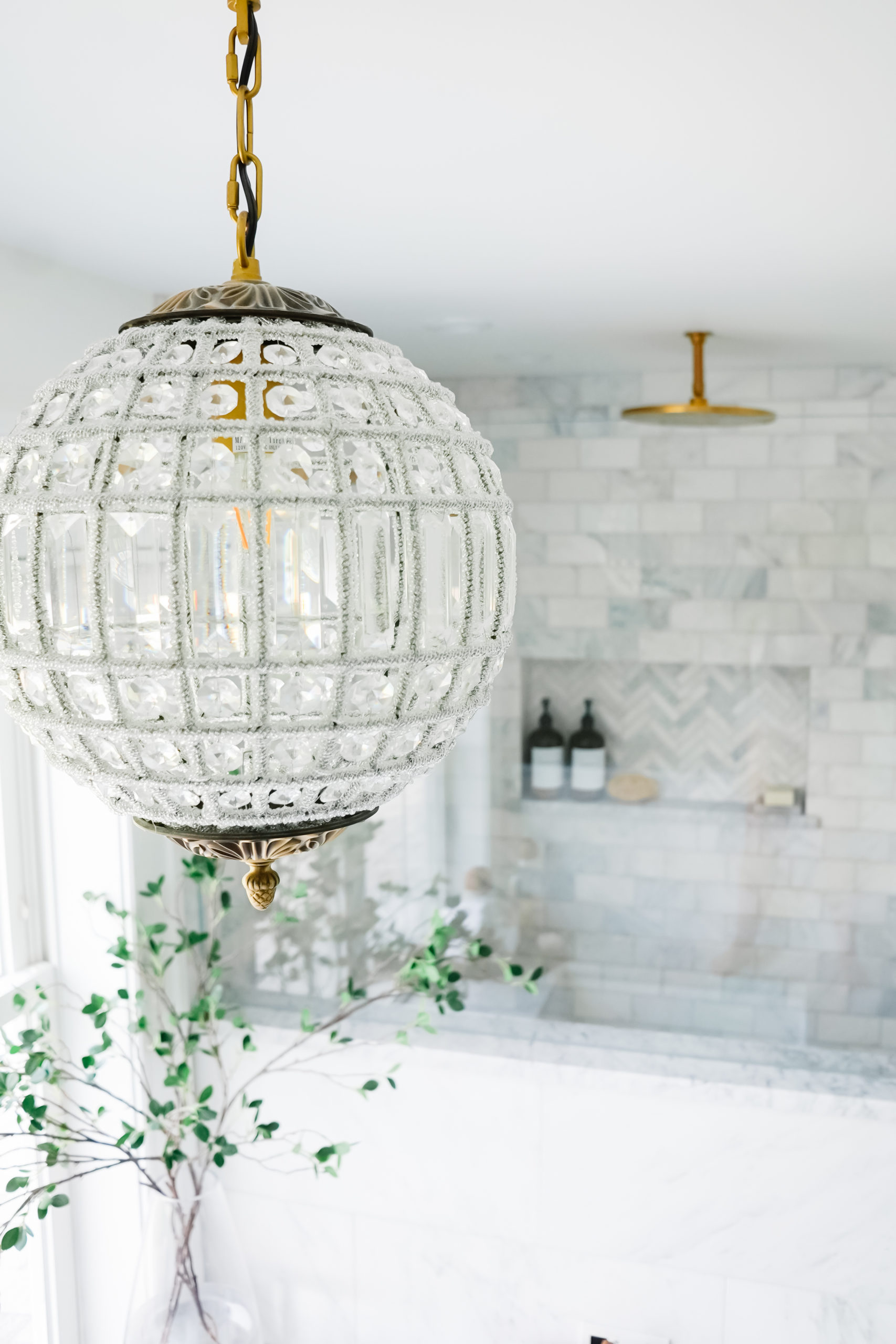
We chose a gorgeous crystal globe pendant to hang above the tub. This is one of my favorite lighting fixtures in the entire house! I originally fell in love with the Restoration Hardware version but this one is identical and available at a much more affordable price point. It looks absolutely stunning lit up at night. We placed this light on a dimmer to have multiple lighting options in this room. I love dimming the lights for nighttime baths and showers.
– CLICK/TAP TO SHOP-
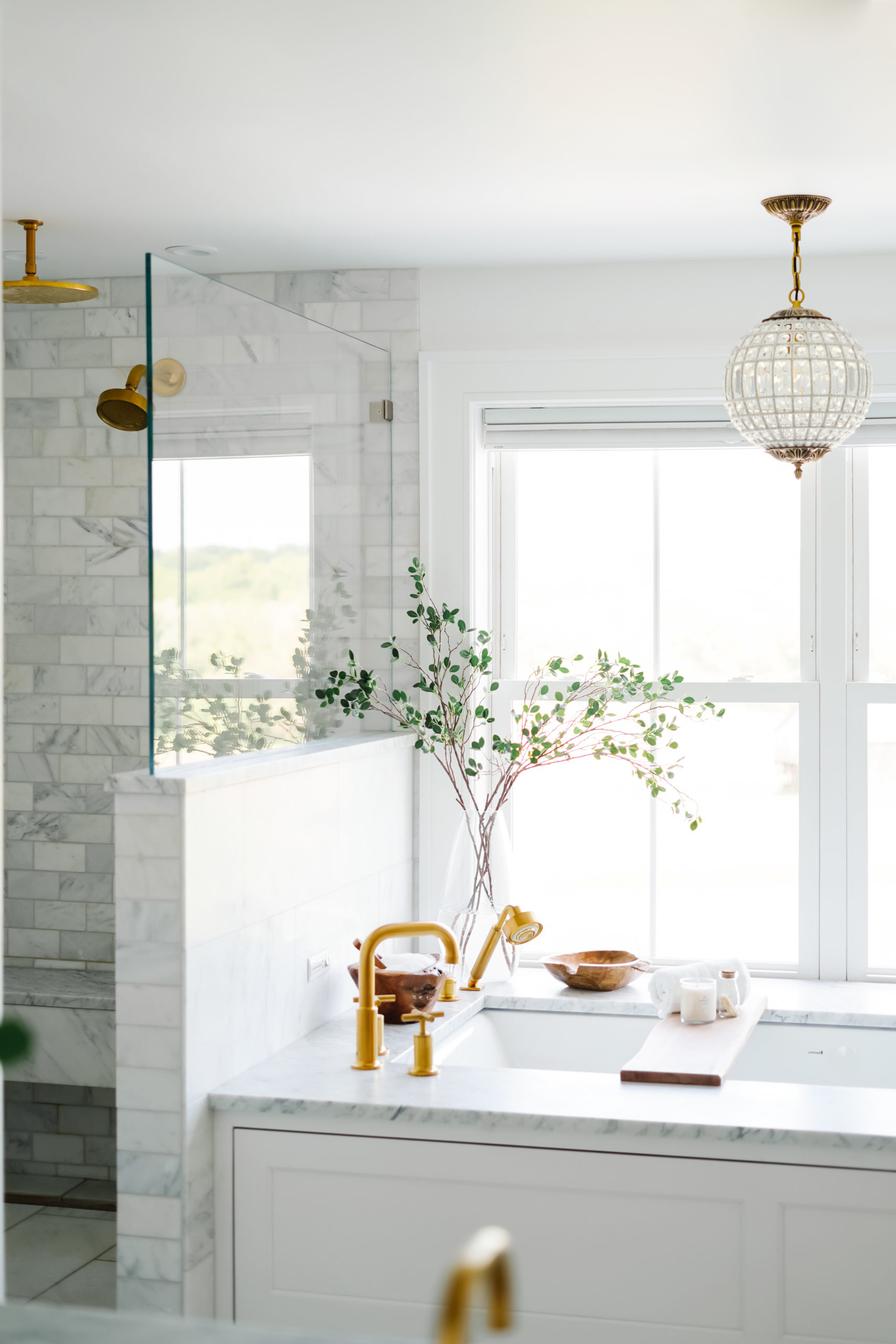

I like to keep decor simple in bathrooms. I prefer a clean and bright spa-like feel which means minimal decor. Almost everything I used to decorate with is also functional – shower bench, tub tray, catch-all dish, bowl for bath salts, shower sponges, dry brushes and candle for ambiance. Less is more when it comes to bathroom decor for me!
I also added my favorite FAUX BRANCHES to display at the corner of the tub. They’re much more practical and low maintenance than decorating with real branches. These come in a pack of 3 or 5 and look so pretty arranged in a vase! Add water the vase to make them look more realistic.
– CLICK/TAP TO SHOP-
CUSTOM BATH TRAY
(CLICK BELOW TO CUSTOMIZE)
VANITY
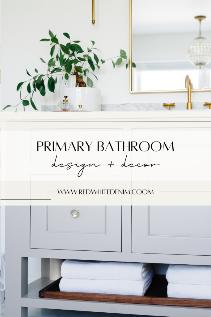
Our vanity is a custom piece by Brighton Cabinetry. James and I designed this ourselves using the BRYANT door style in SHADE finish. We chose to build custom mainly because of the size vanity we wanted for this space. Our vanity is 98″ long. Most pre-fab vanities max out at 72″. Vanity countertop is Carrara marble to match tub surround.
If you love the look of this vanity but don’t need something quite as big, I’m linking some great prefabricated options below (most include countertop!)
SIMILAR PREFABRICATED VANITIES
– CLICK/TAP TO SHOP-
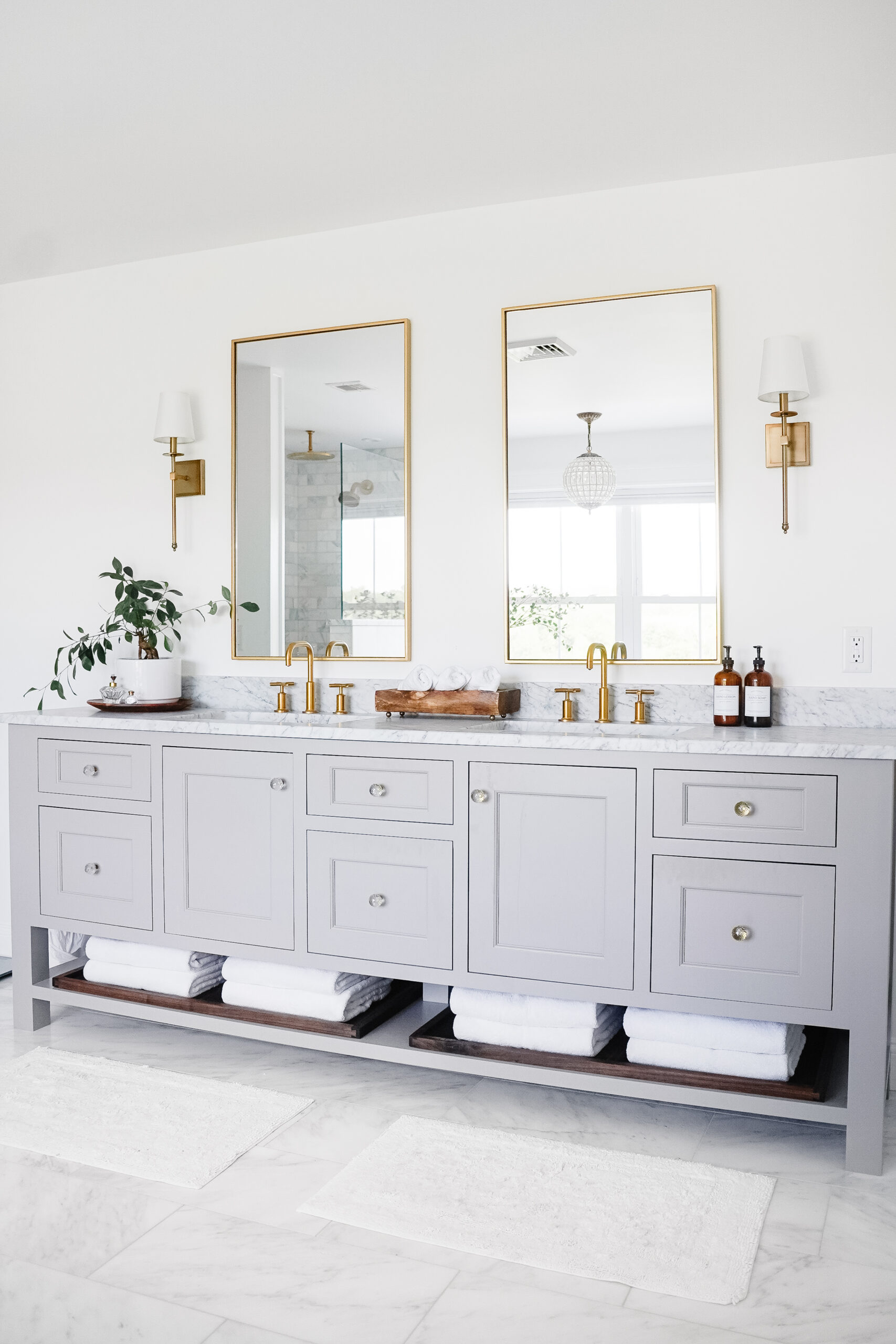
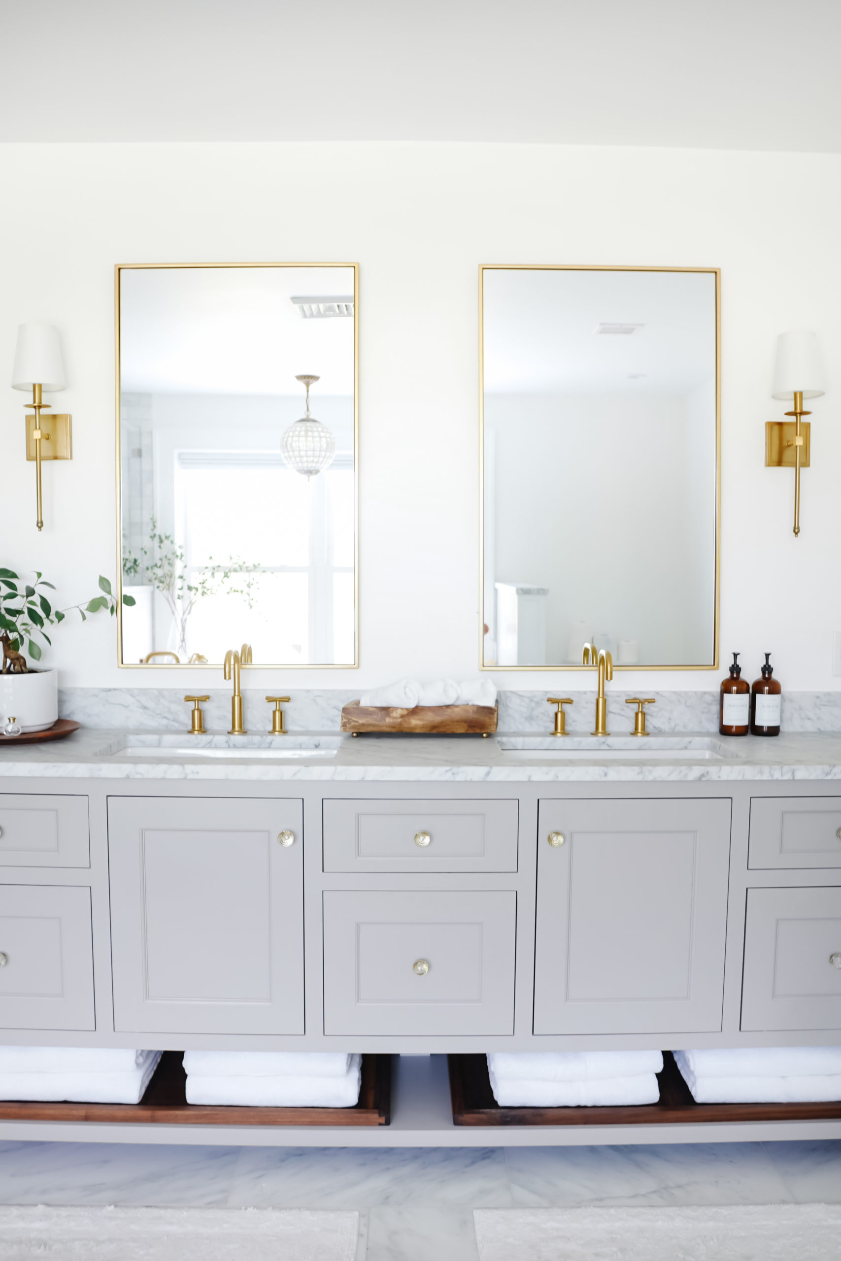
The vanity fixtures are by Kohler, matching all the others in the primary bathroom. We chose a taller than average RECTANGULAR MIRROR to display above each sink. The mirrors are trimmed in a thin antique gold finished frame and available in several different finishes and sizes. We have the 40″ x 24″ size.
Since this was a custom vanity it did not come with knobs. We used these beautiful vintage CRYSTAL KNOBS from my husband’s grandparents house. I love any opportunity to repurpose/reuse items from our family around the house! These stunning knobs were the perfect detail to add to our vanity. I found something almost identical (new) that I linked below.
– CLICK/TAP TO SHOP-
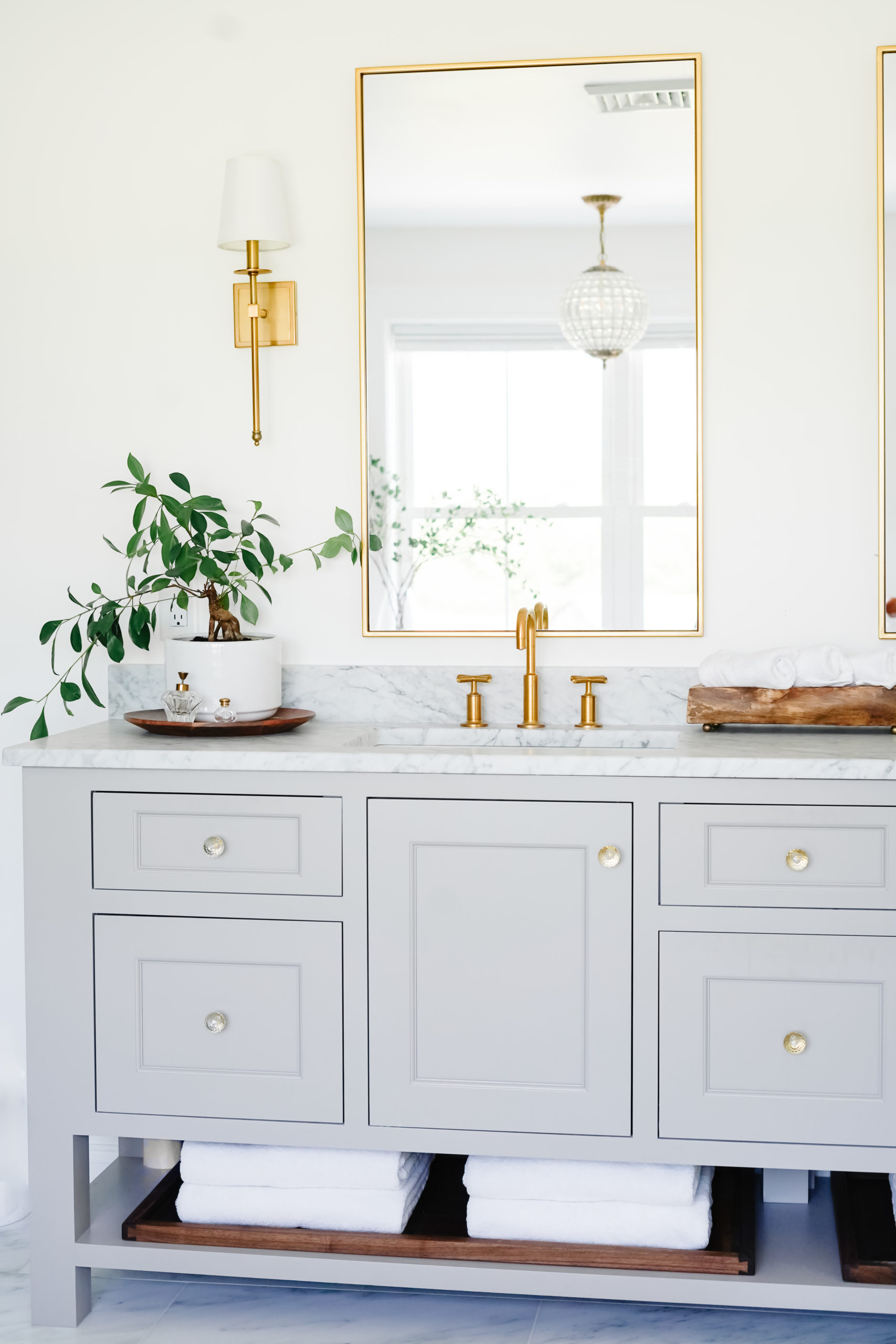
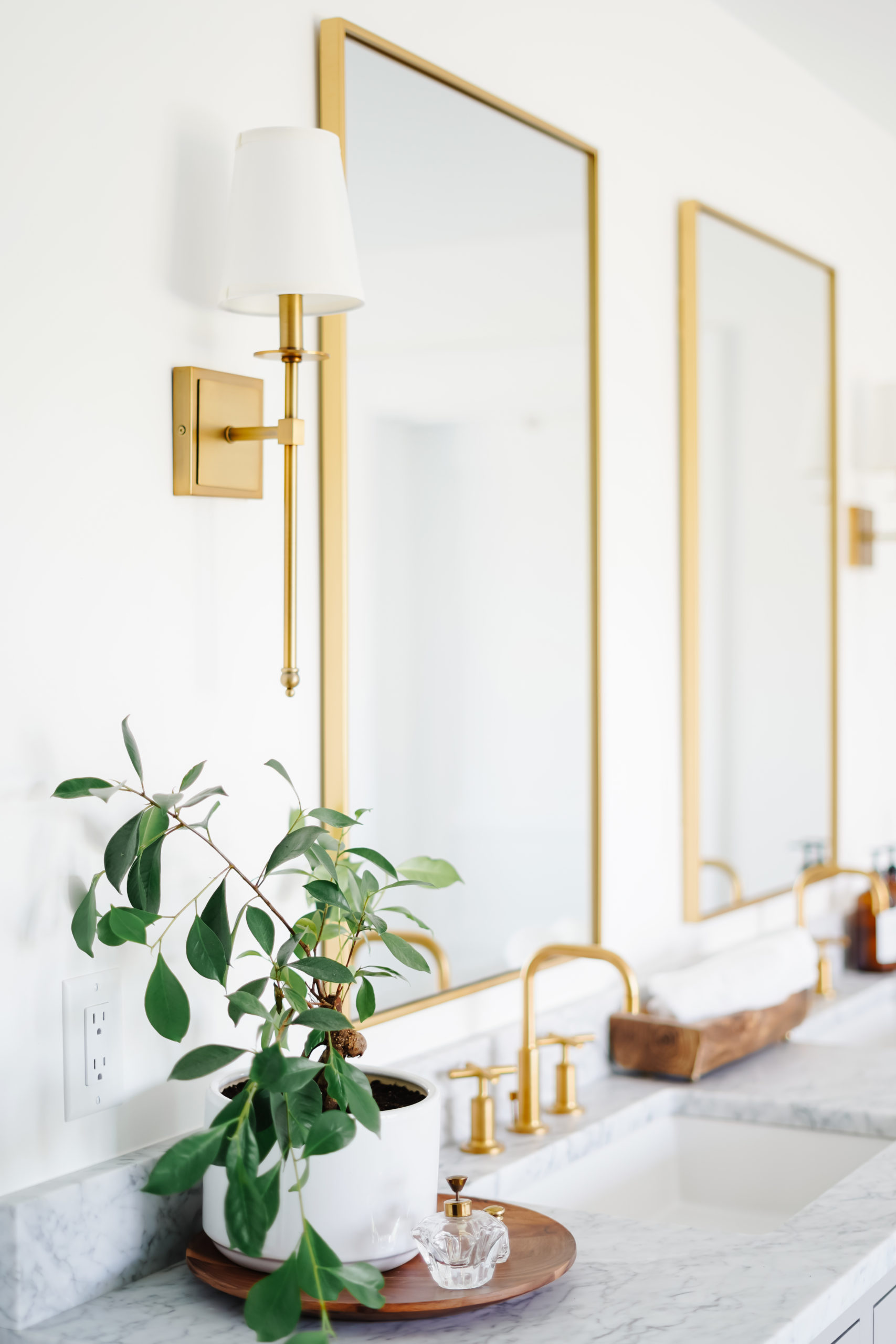
I wanted something simple and classic for the lighting above the vanity. We chose a tall gold wall SCONCE with white fabric shade. The warm brass finish matches the gold fixtures and mirrors perfectly. These sconces come in 3 different size options, we have the 20″ size.
– CLICK/TAP TO SHOP-
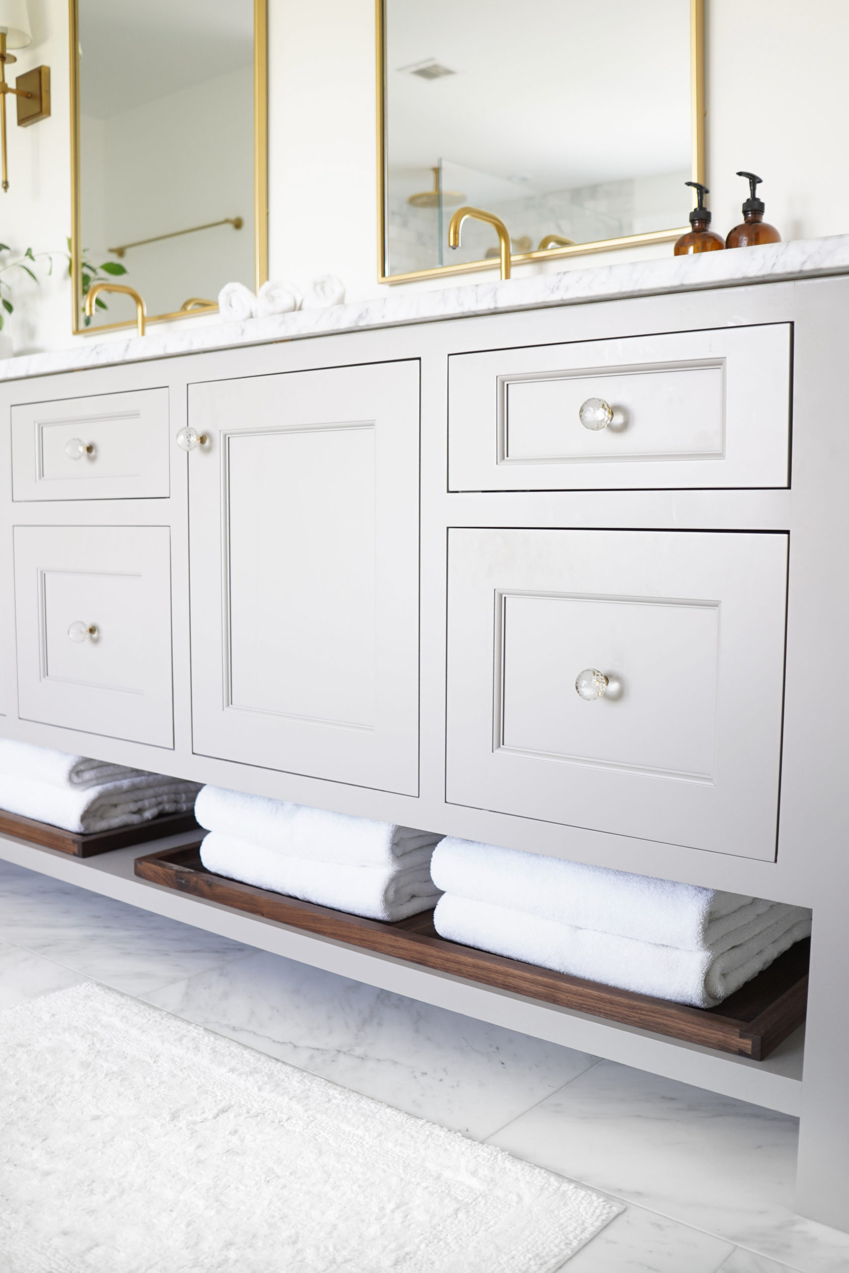
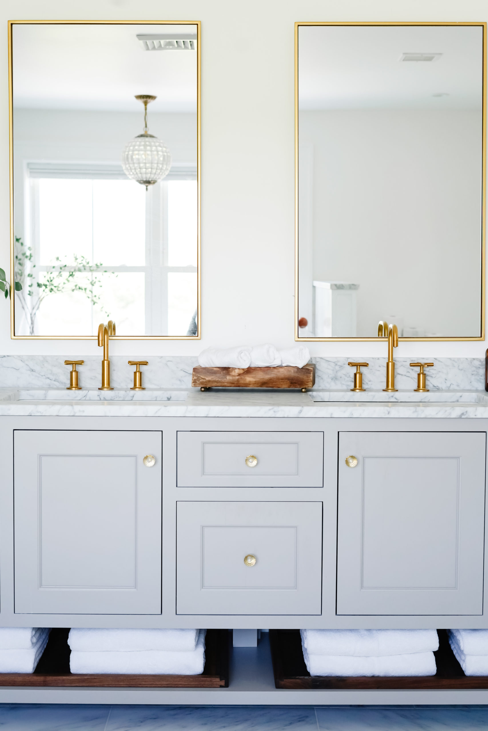
The bottom shelf of our vanity was designed for towel storage. I liked the idea of displaying white towels in this area and figured it be be the most convenient and easily accessible option. I always envisioned these towels held in a wood tray and was lucky enough to find the perfect option and size on Amazon! These handcrafted walnut wood trays are just the right width and size to fit our vanity – I have the exact size we purchased linked below, however the brand offers many different size and shape options to fit your space – you can browse their storefront HERE.
– CLICK/TAP TO SHOP-
LIKE THIS MARBLE BATHROOM POST? PIN IT!
SAVE IT ON PINTEREST BY CLICKING THE ‘SAVE’ BUTTON ON ONE OF THE PHOTOS BELOW!


Loved the bathroom! We are going to be renovating our master bath, we are also in CT and have a similar size bathroom. Just wondering how much your Reno cost. We have had estimates for about $60K which we weren’t prepared for, all your finishes, tile, vanity would be something we would even choose.
that is such a hard question to pick my favorite thing! It all works together perfectly. I think if I had to choose it would be the cabinetry and flooring. and that tub! that s my top 3 things,LOL! That wall that functions as a room divider with the stone on it is really cool. It s nice to see a different bathroom concept after so many monotonous ones we ve been looking at a lot as we are designing our own home. Thanks for sharing .