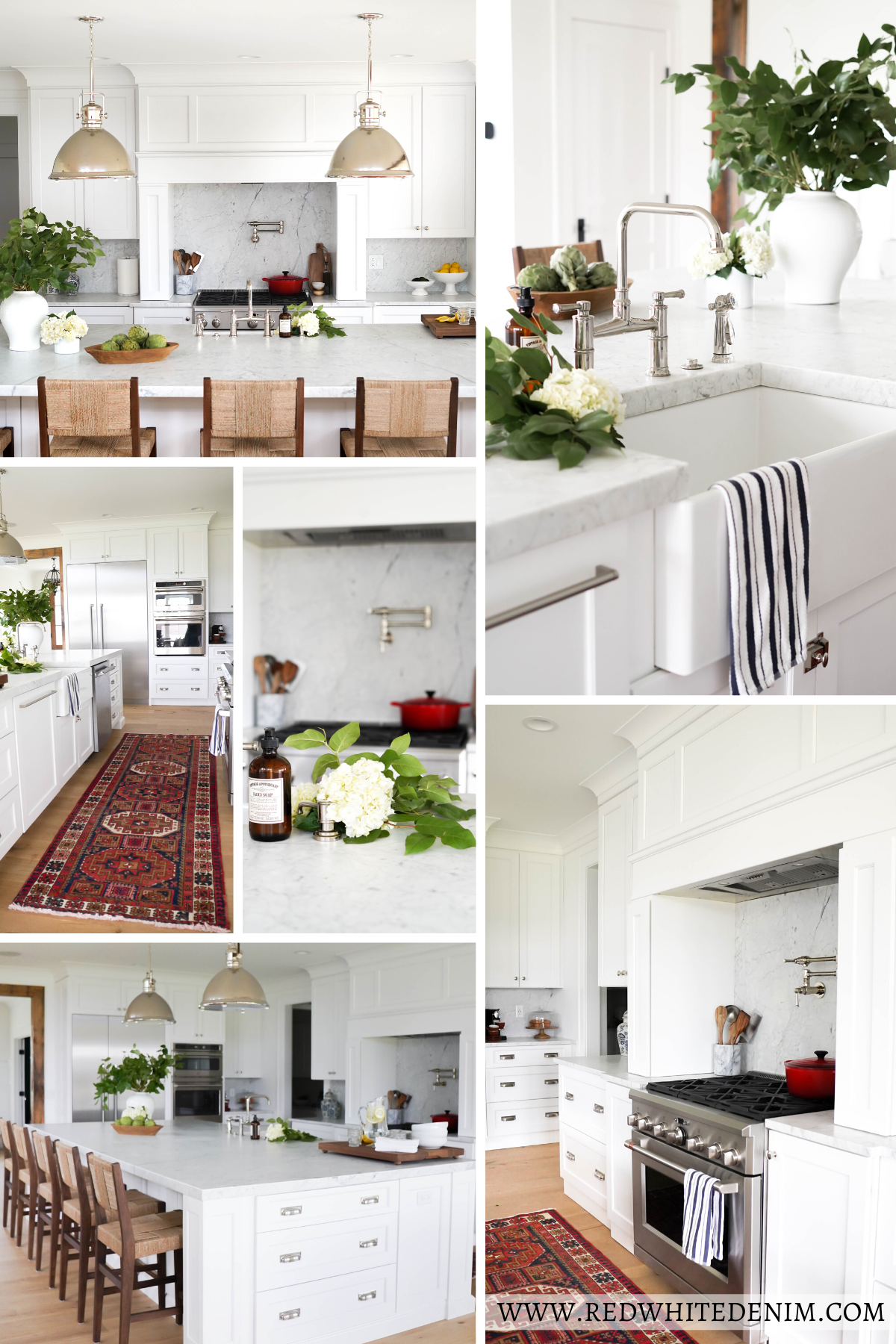
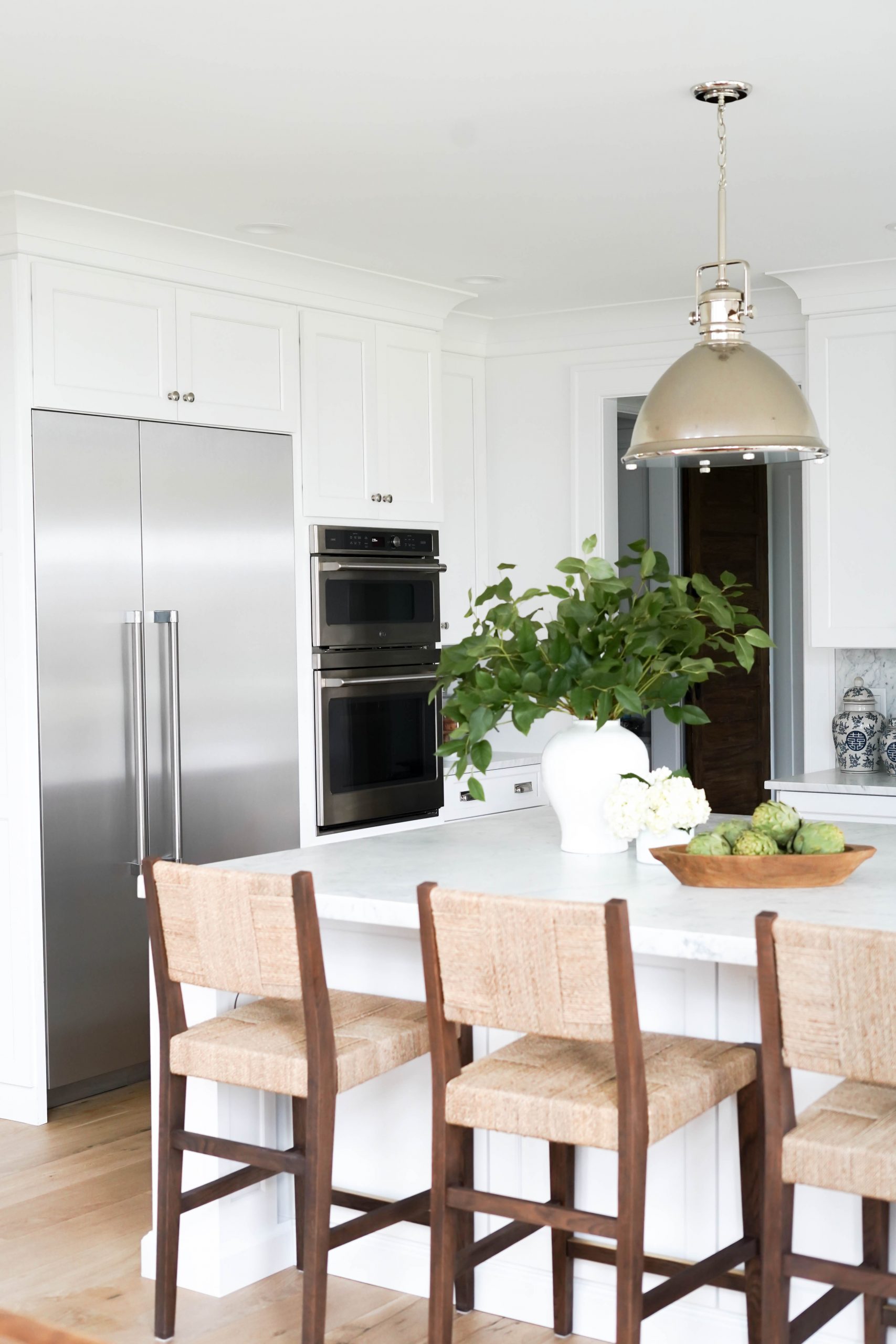
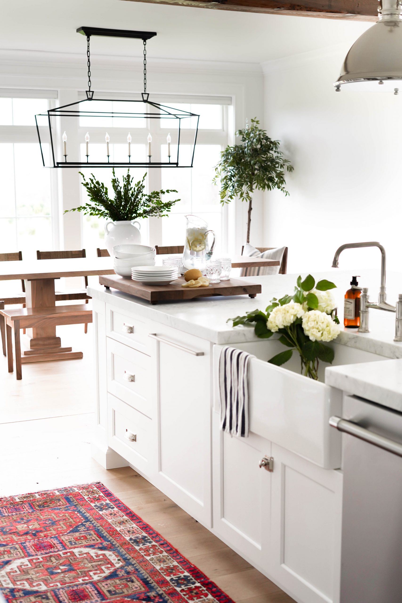
I’m so excited to finally share my kitchen reveal! All it took was some spring cleaning and fresh blooms to motivate me to get this space photo-ready! In today’s post, I’m taking you on a photo tour of our kitchen and dinette. We have an open layout on our first floor that’s been great for everyday living and entertaining! We don’t have a formal dining room in the house, so our dinette is used for everyday meals as well as larger get togethers and dinner parties. Keep reading to see more of our white marble kitchen design!
For more home inspo, follow me on Instagram at @redwhiteanddenim.
WHITE MARBLE KITCHEN DESIGN
COUNTERTOPS & BACKSPLASH
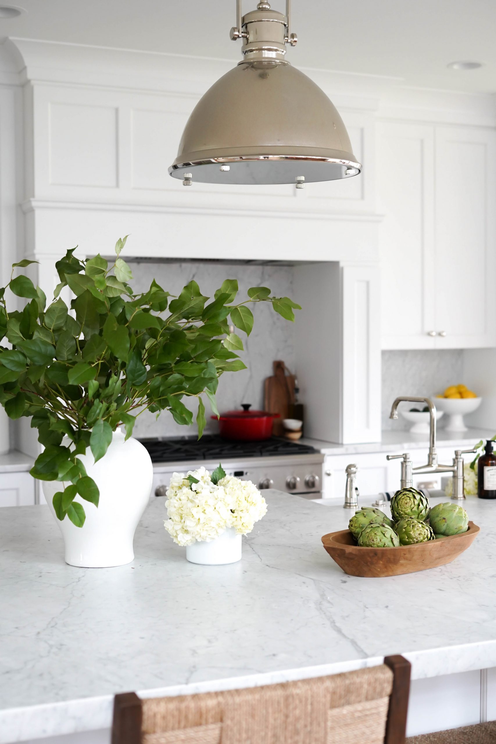
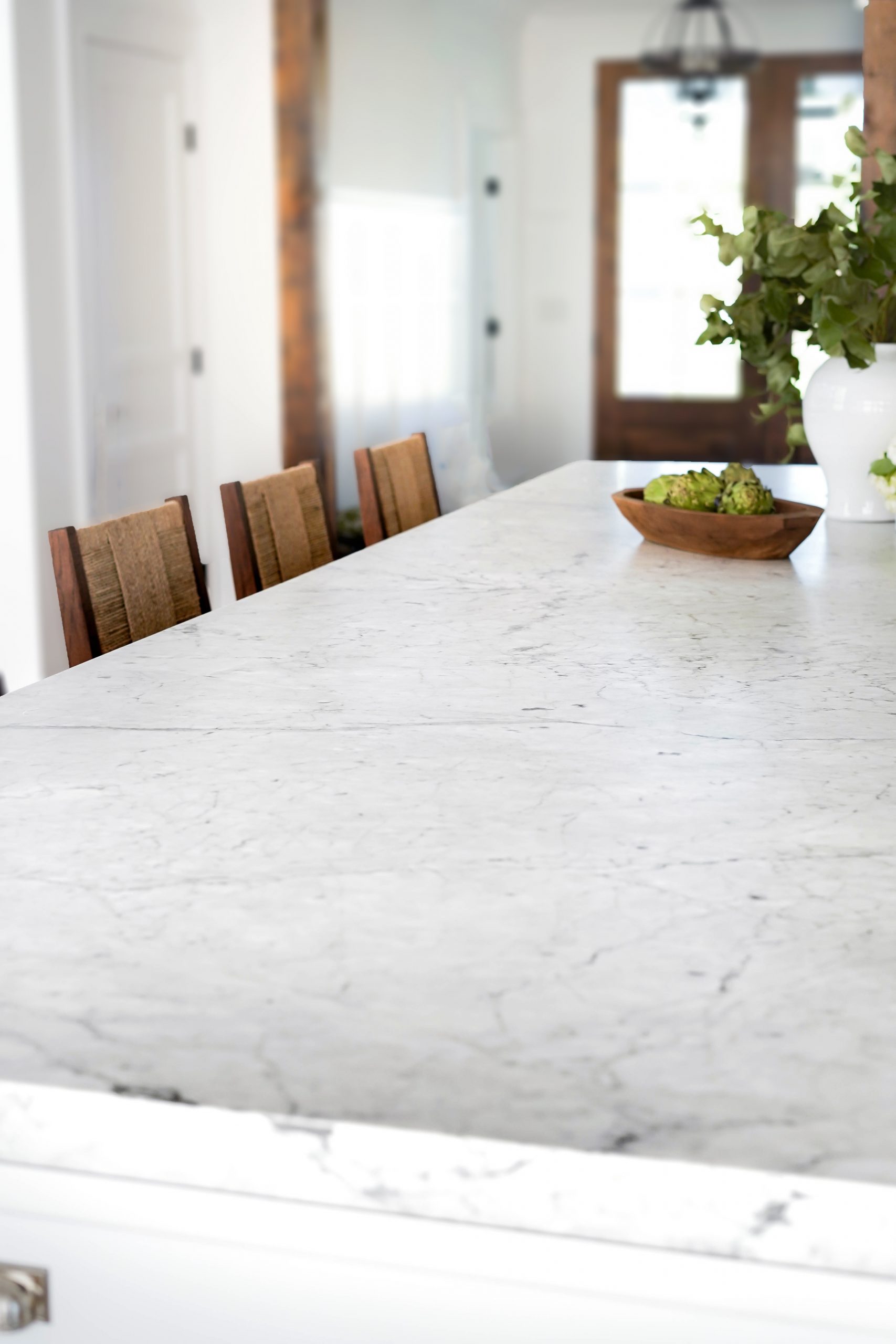
I’ll start off with our countertop material, since that seems to be the kitchen detail we get asked about the most! We went with honed Carrera Marble for both our countertops and backsplash throughout the entire kitchen. I always knew we wanted a white marble kitchen and I’m so happy with the decision.
Why we chose marble over quartz…
I’m often asked if we are happy with our decision to use marble over quartz. The simple answer, YES. I love the look of natural stone and have yet to see a faux alternative that truly looks like real marble. When choosing our countertop material, James and I were well aware that marble would be soft and porous and that it would definitely etch and possibly stain. We were ok with etching, but not ok with staining. So we did our research and found that as long you have your marble sealed properly, it won’t stain.
Thankfully the company we purchased our marble from, Pistritto Marble, offers a fabulous marble sealant with 15 year warranty. Before making our purchase, they gave us a small piece that was sealed to experiment with. We put red wine, ketchup and lemon juice on the slab and let it sit overnight. In the morning, the ketchup and wine wiped right up with no stain. The lemon juice left an etch, but no stain. Bottom line, if you seal your marble properly and don’t mind etching, you should have no issues with the use of marble in your kitchen. However, if you’re someone who loves the look a perfectly polished countertop, quartz may be a better option. For us, the gorgeous look of natural marble (which I don’t think can be replicated) outweighs the etching we’ve experienced. But it’s really just a personal choice!
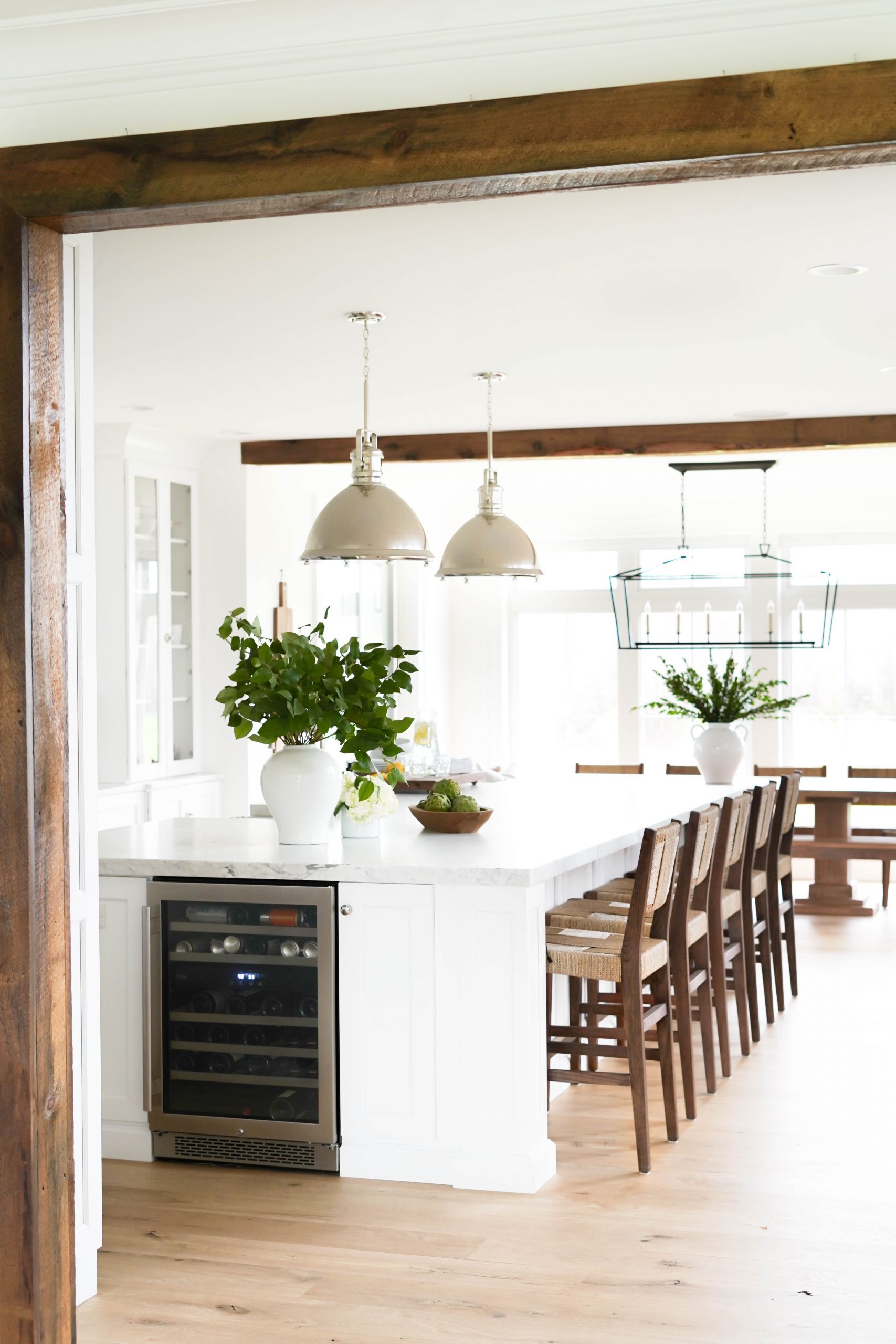
We chose a straight edge on all our countertops for a clean and modern look. We also loved the look of thicker slabs (standard slabs are only 1 1/4″) so we had our island countertop custom made with a mitered built up edge to give the illusion of a thicker slab of marble. I wouldn’t necessarily recommend doing it on all your countertops (it can be pricey), but it really makes a statement when done on a kitchen island.
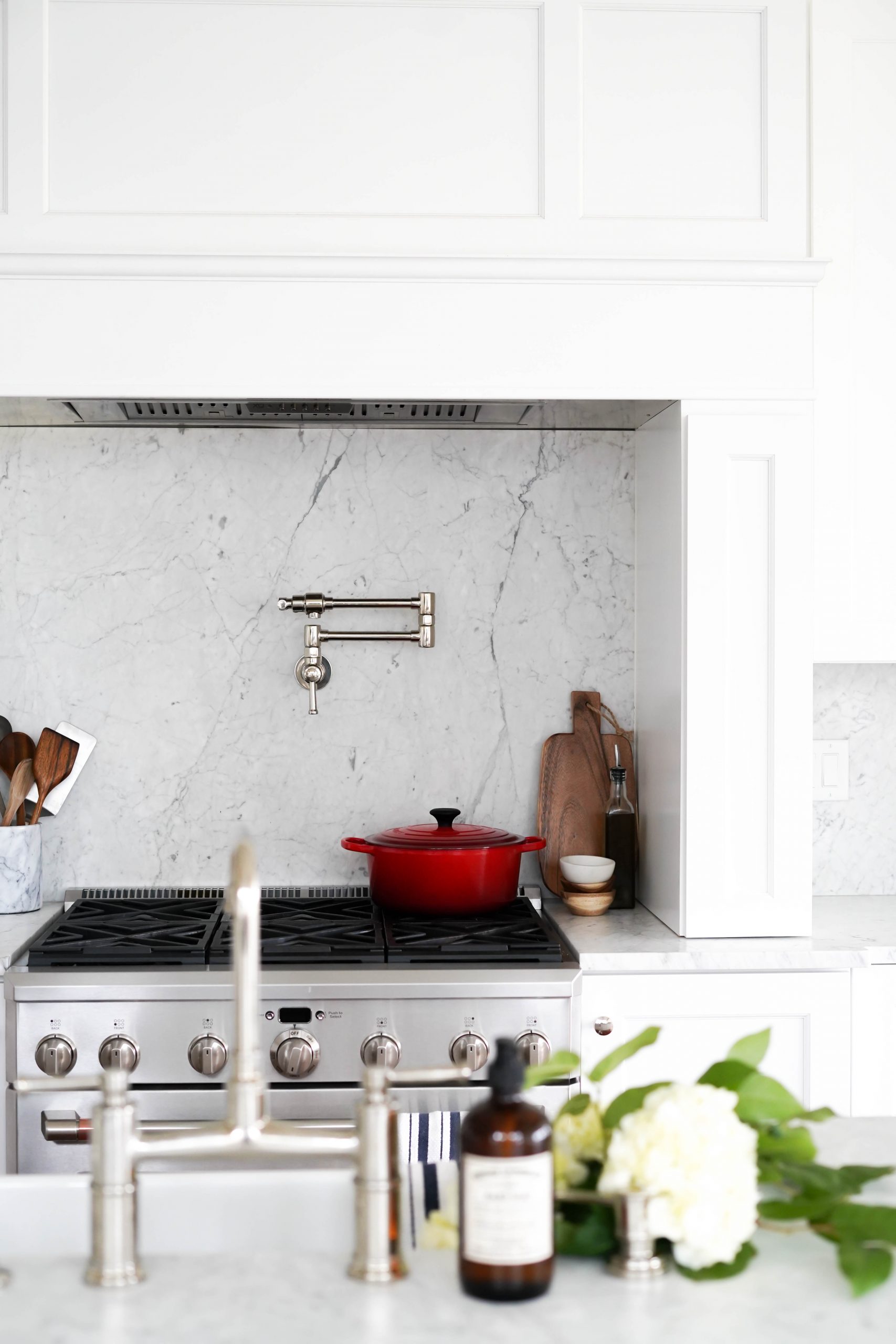
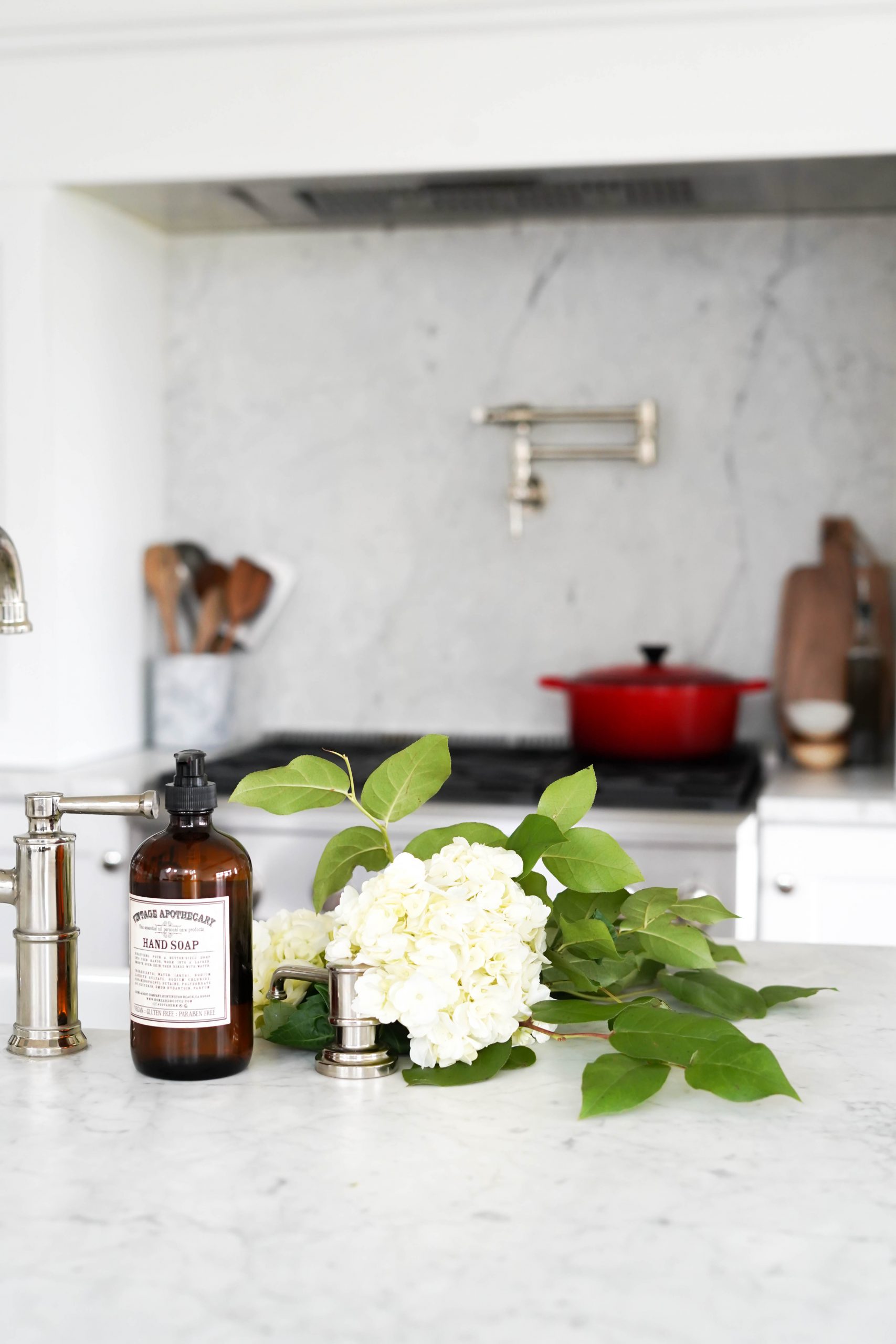
For our backsplash, we used matching Carrera Marble slabs as a continuation of our countertops. Using the same material creates a clean and seamless look in the kitchen – we love the way it turned out!
NOTE: Something we learned about marble throughout this process – not all Carrera is the same! When you’re shopping for slabs you’ll quickly learn that Carrera comes in all different variations and prices. The more white (and less grey) you want in your Carrera, the pricer your slabs will be.
CABINETS & HARDWARE
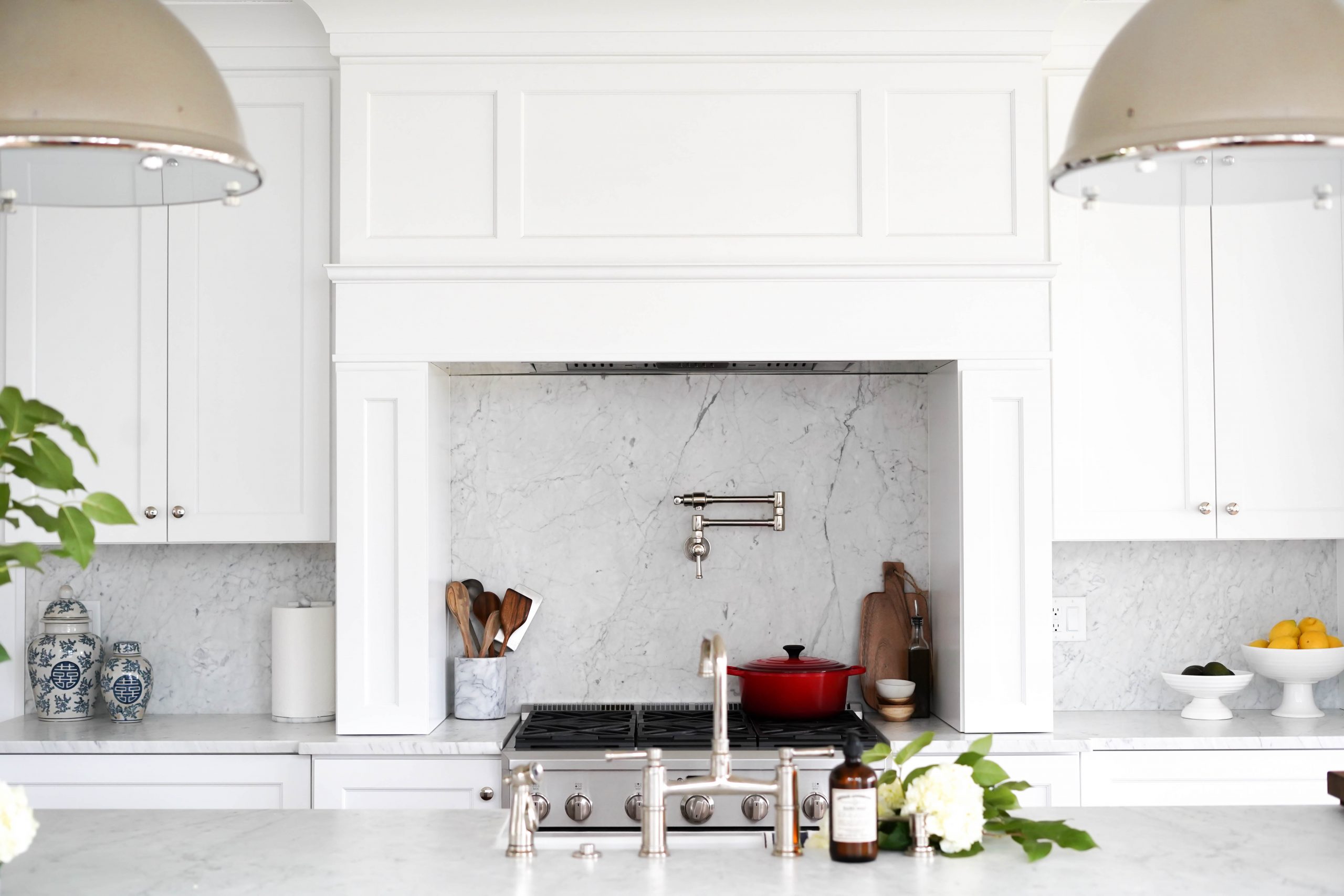
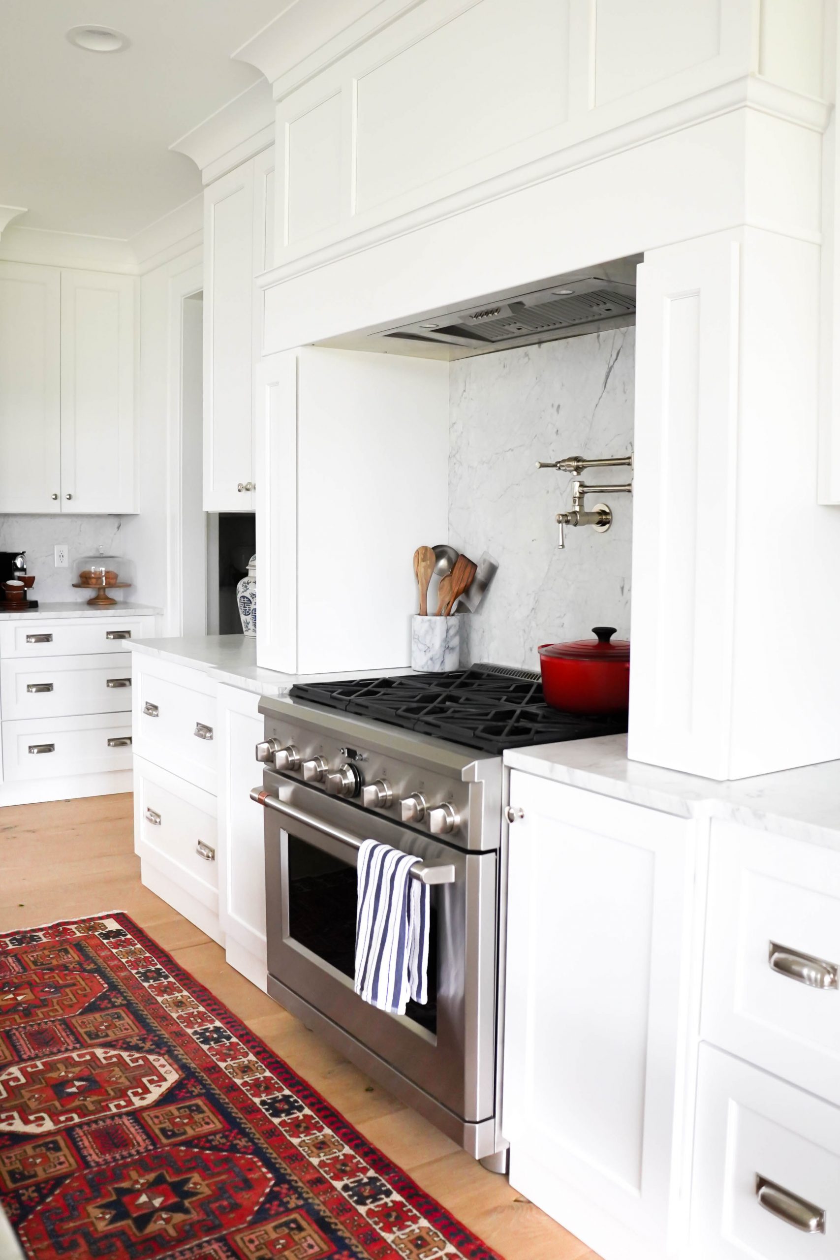
All our cabinets are by Brighton Cabinetry. James and I knew exactly what we wanted the layout of our kitchen to look like, so we worked with a kitchen designer to make that vision come to life. We chose painted white maple cabinets in door style “Bryant.” Our hood was custom designed using matching panels. We also had spice drawers built-in to the columns on each side of our hood for easy access when cooking!
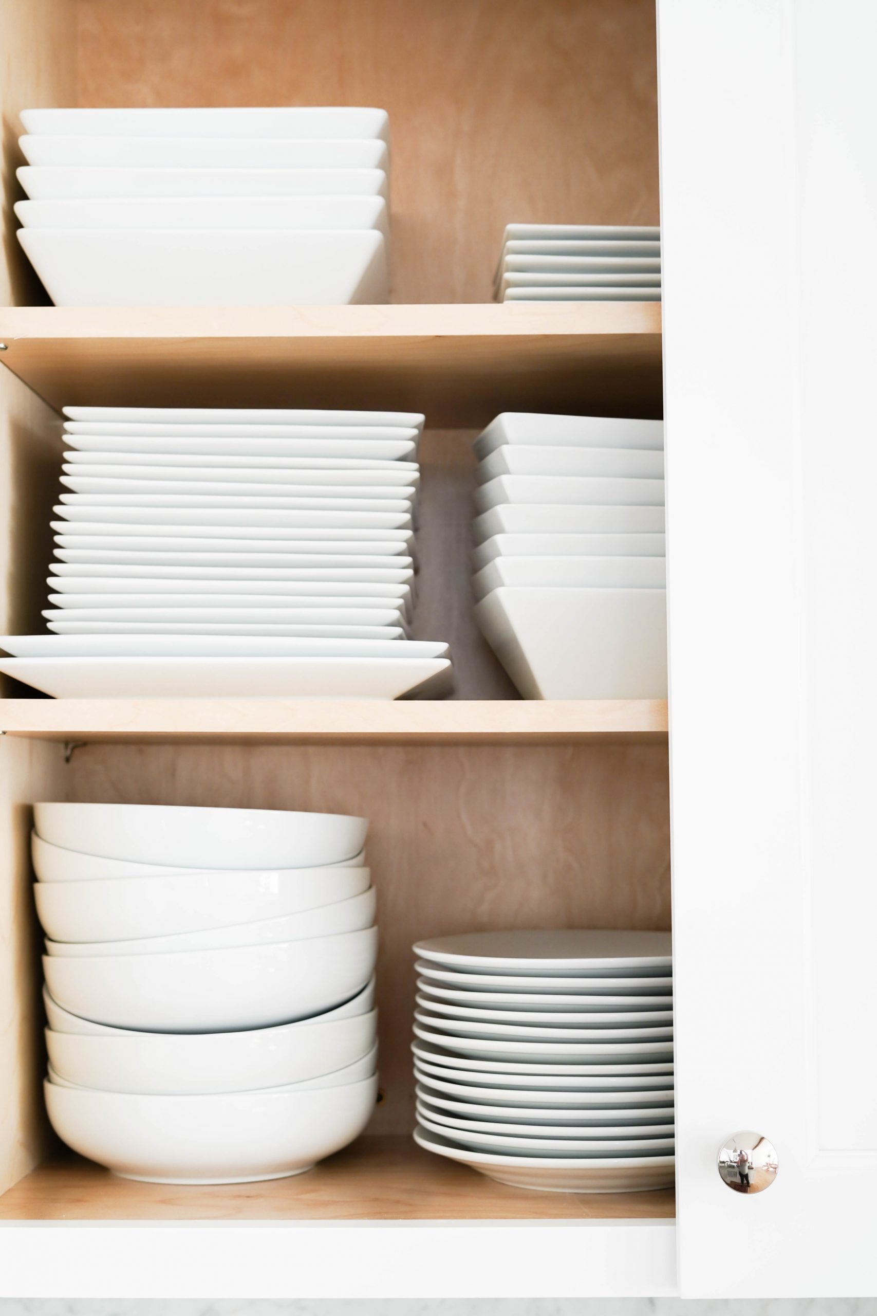
The majority of our lower cabinets are a mix of various sized drawers – shallow for flatware and cooking utensils mixed with oversized for pots and pans! The upper cabinetry is all tall cabinets with shelves. I think tall cabinet doors (rather than 2 cabinets stacked) makes the overall room feel bigger and ceilings taller. All upper cabinets are finished off with a thick crown molding – also by Brighton Cabinetry – that blends with all the other crown molding in our home.
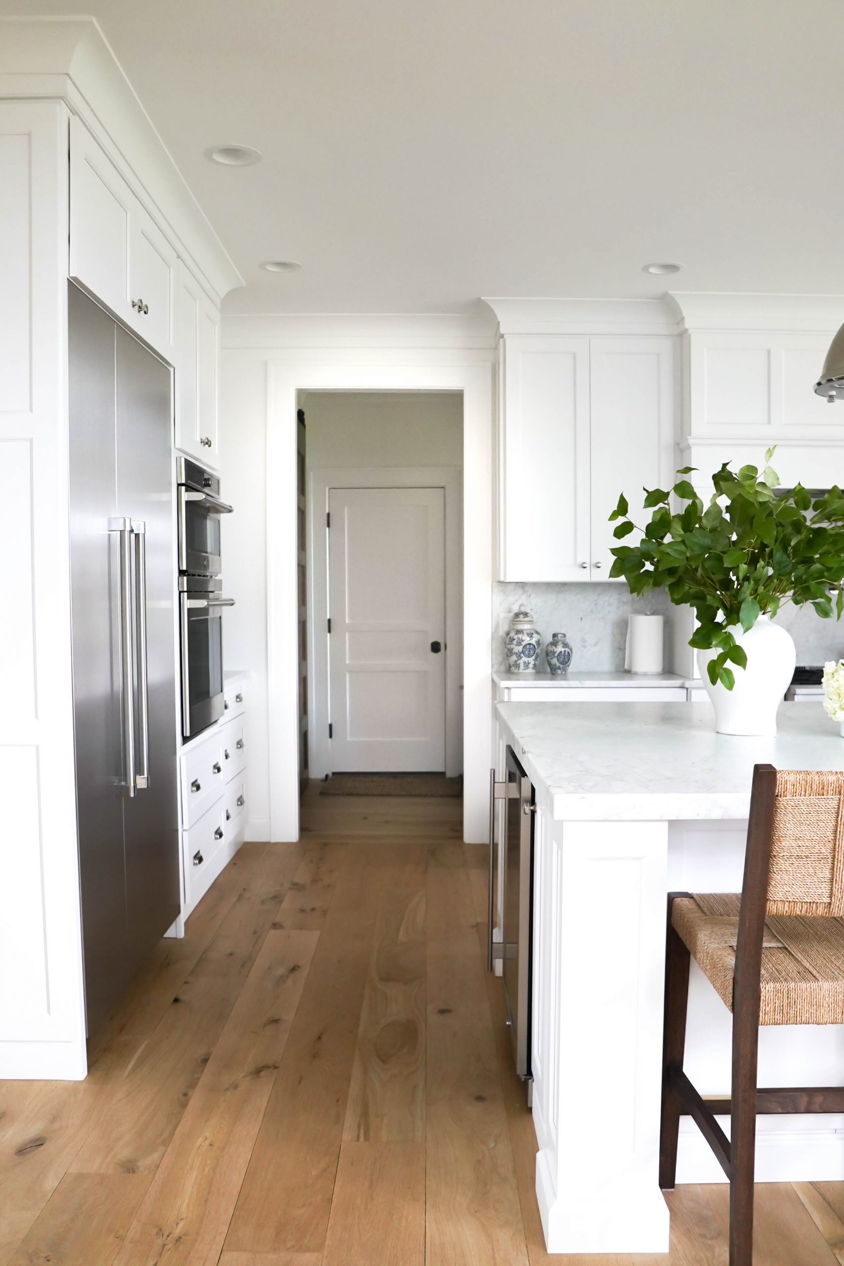
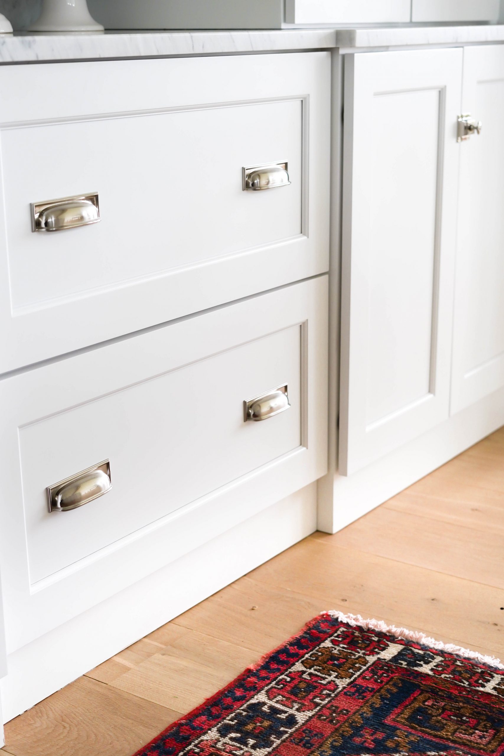
All hardware in the kitchen is nickel, which has warm tones and blends well with our stainless appliances. We went with a simple mushroom style cabinet knob in polished nickel for all our cabinet doors. For the drawers, we used cup style pulls. I love that these cup pulls have a square backplate, giving them a traditional yet modern look. These particular drawer pulls are actually brushed nickel, although they look partially polished. I loved this option because they are polished enough to blend with the other nickel hardware and fixtures in our kitchen, but is dull enough to prevent fingerprints – they’re perfect. We also mixed in latch-style hardware on several cabinet doors for some variety.
– CLICK/TAP TO SHOP-

ISLAND
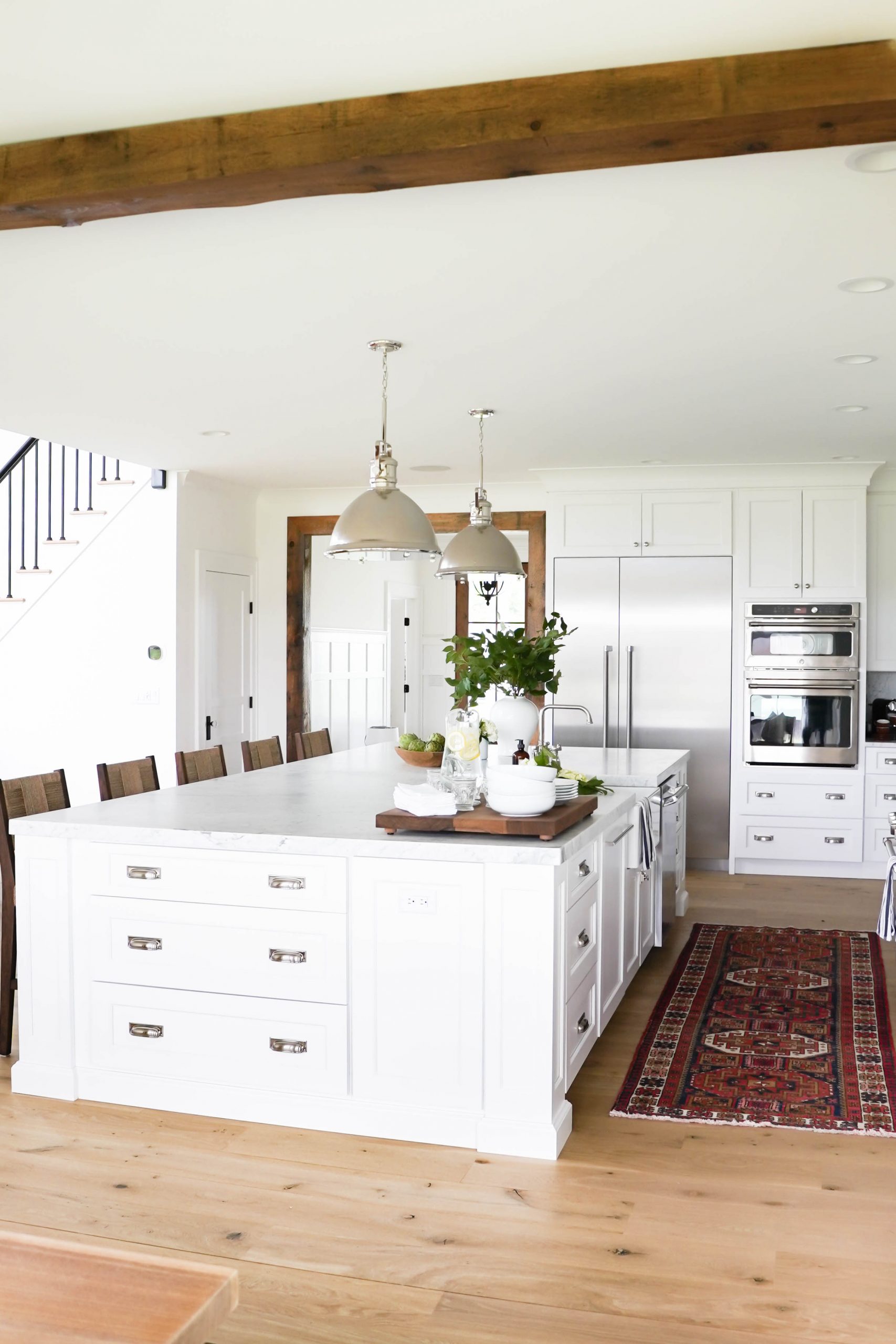
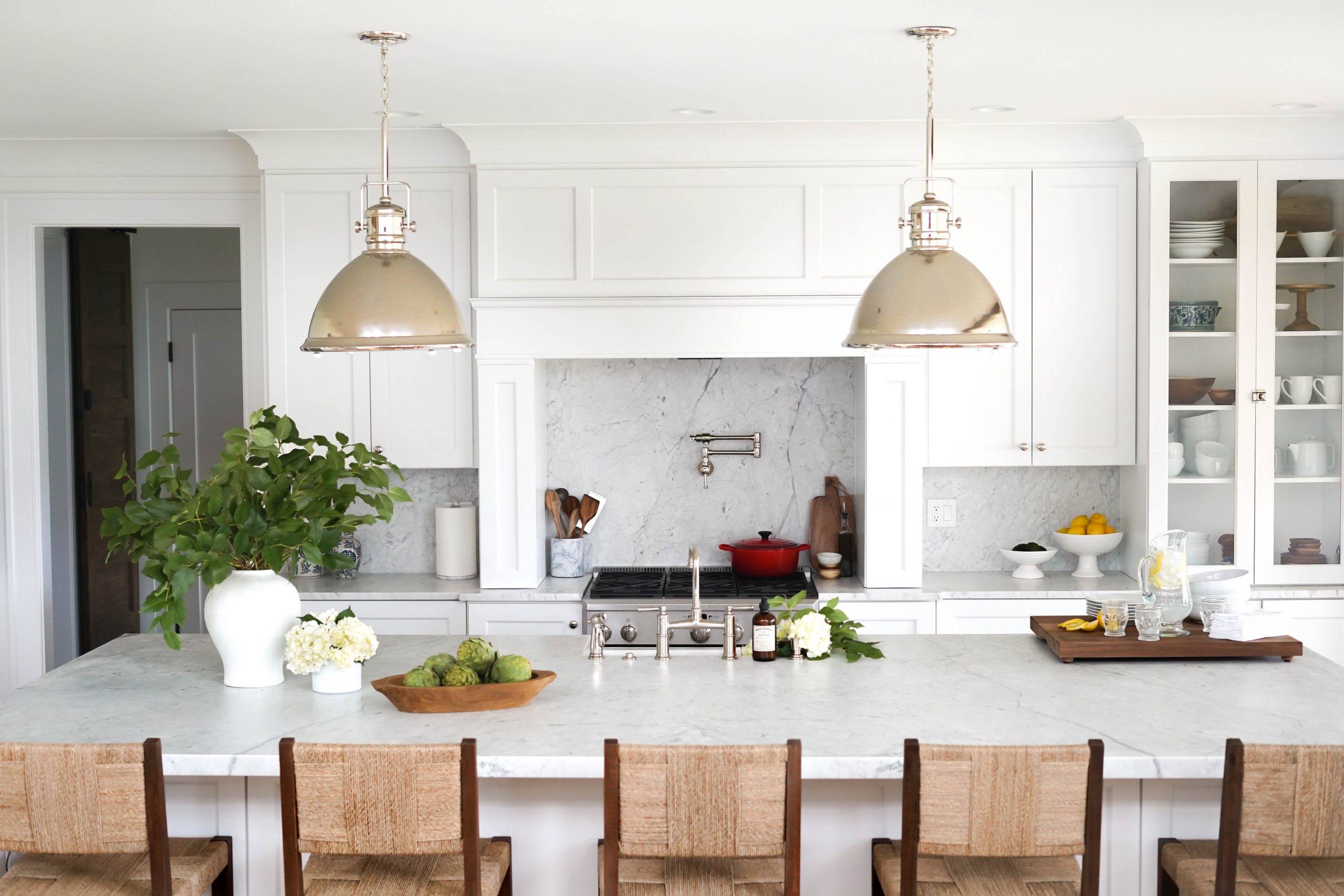
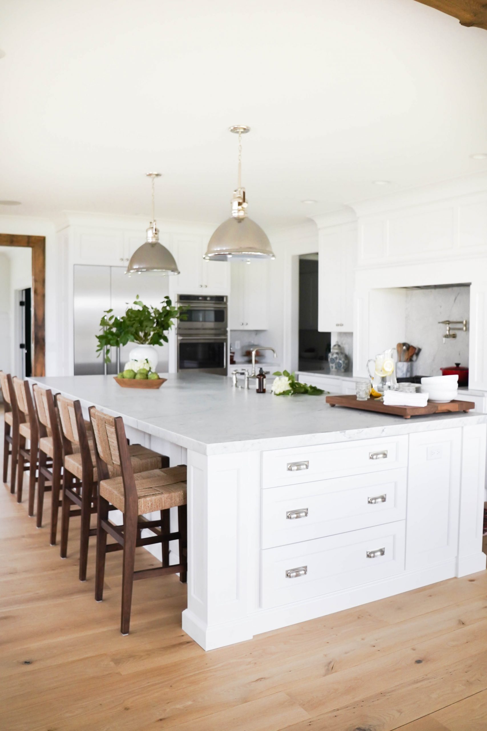
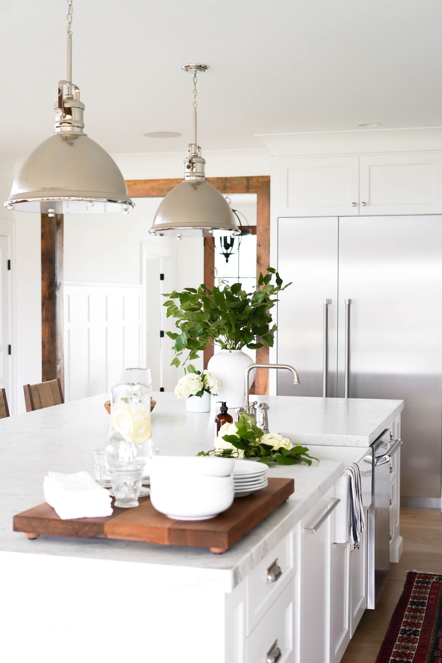
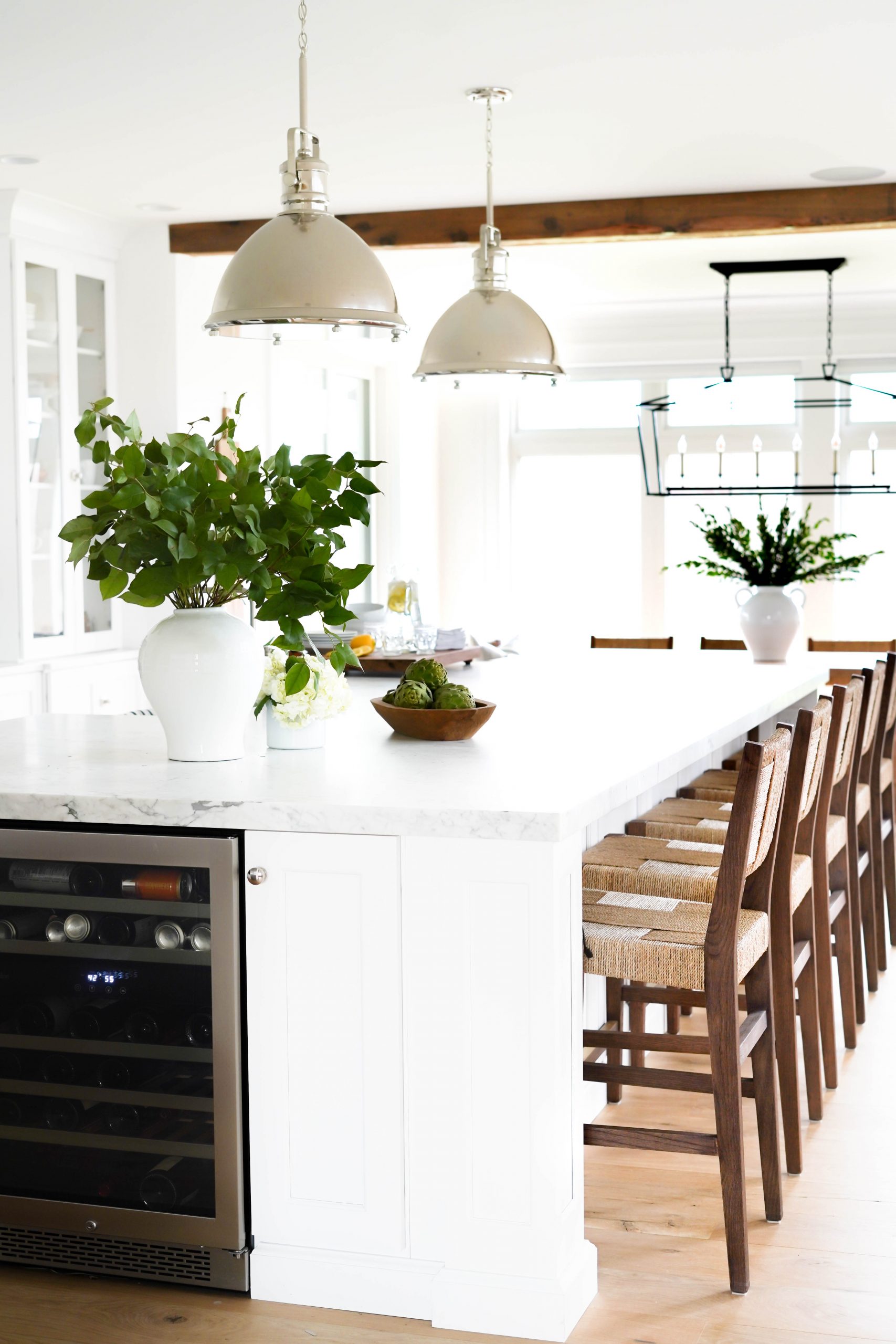
Our kitchen island is probably my favorite part in this entire space and another piece we get asked about often! We went with an oversized kitchen island that serves as a great cooking and entertaining station, as well as a statement piece in the room. This is another piece we had custom designed with Brighton Cabinetry. It houses our dishwasher, trash/recycling, wine fridge and drawers on 3 of the 4 sides. It’s finished off with thick square columns on each corner. We also added outlets/USB ports next to all the the columns for cooking appliances and phone chargers!
The dimensions are 6 x 12 feet and comfortably seats 5 counter height stools. We weren’t able to source a marble slab large enough to cover the entire island, so we used two slabs. They’re joined together with a barely noticeably seam that goes down the center of the island. Pistritto Marble did a great job making it look like 1 piece!
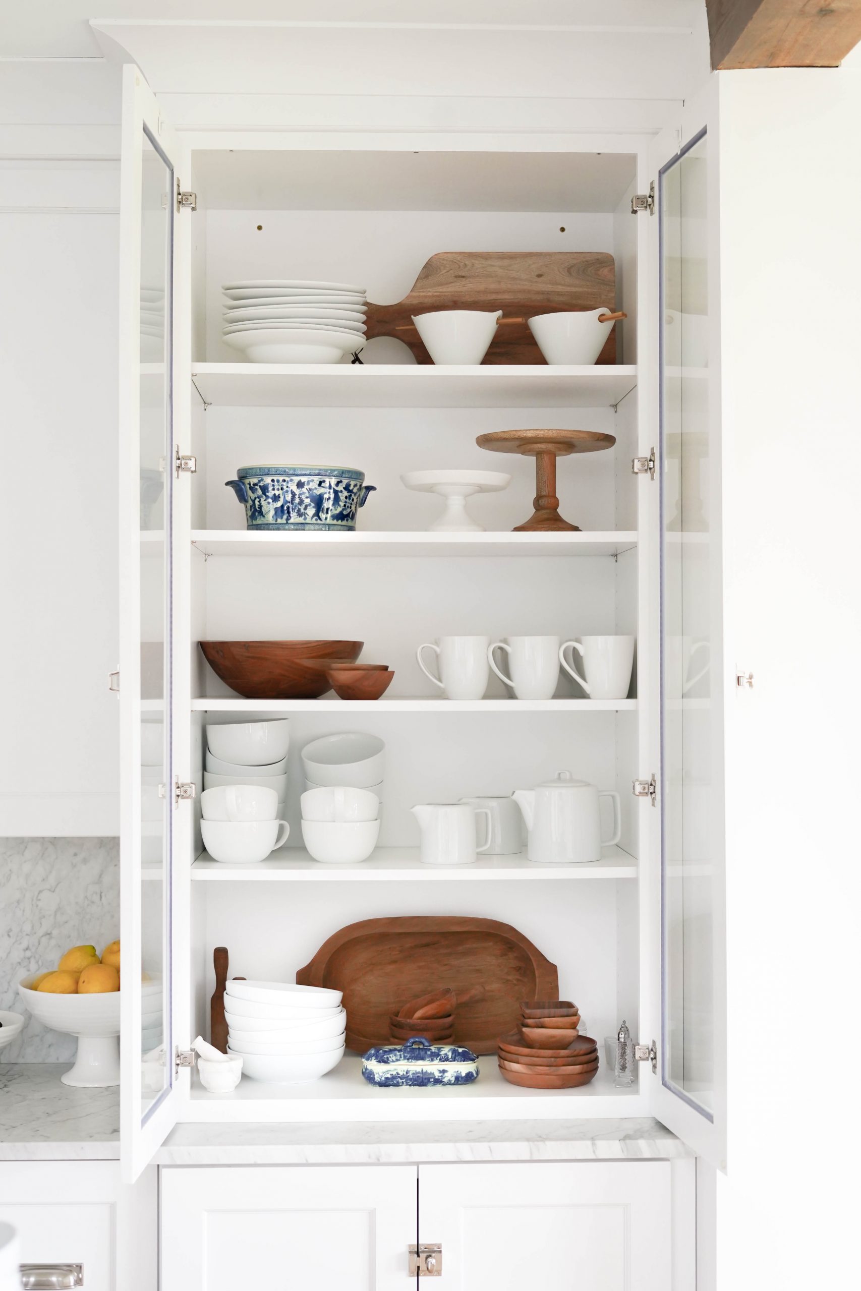
HUTCH
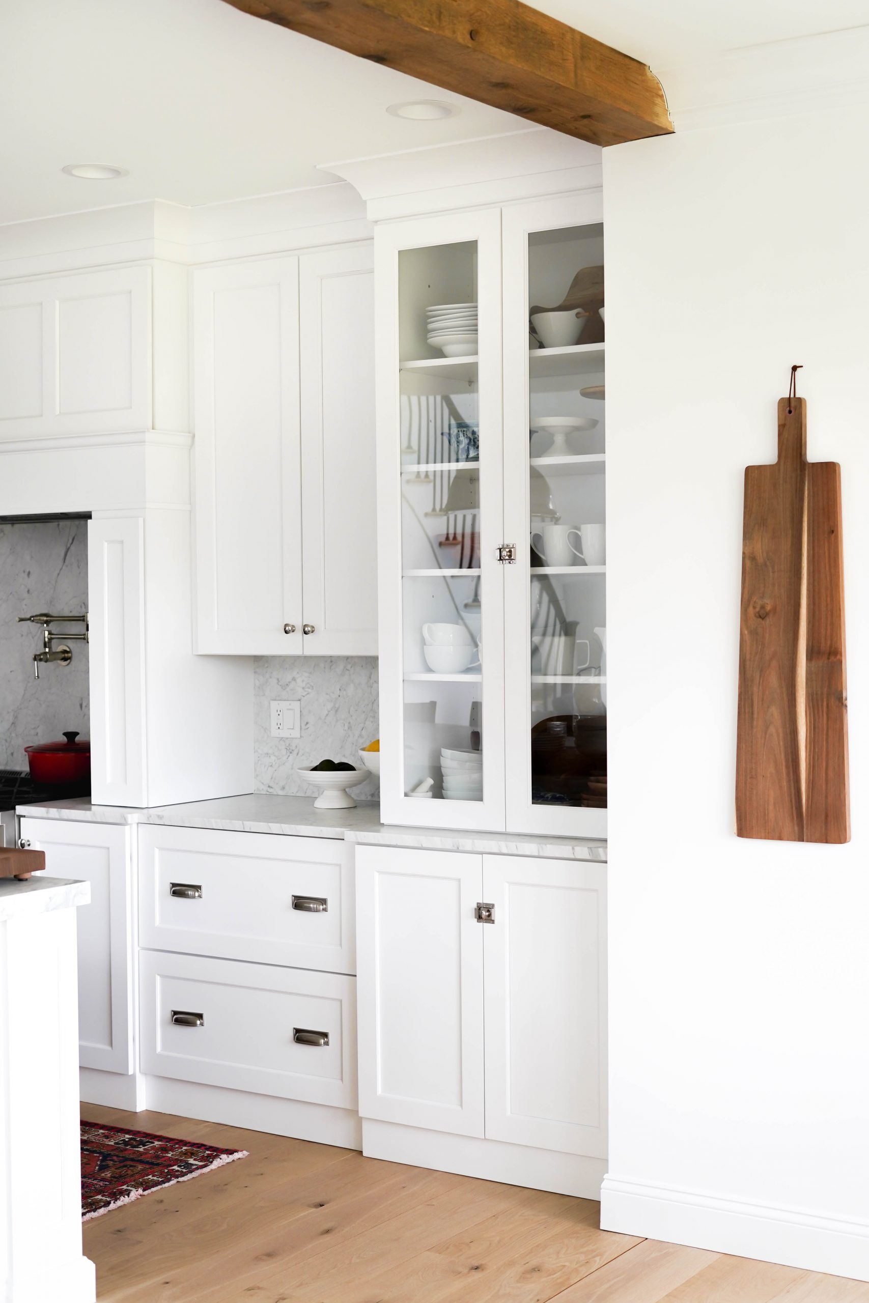
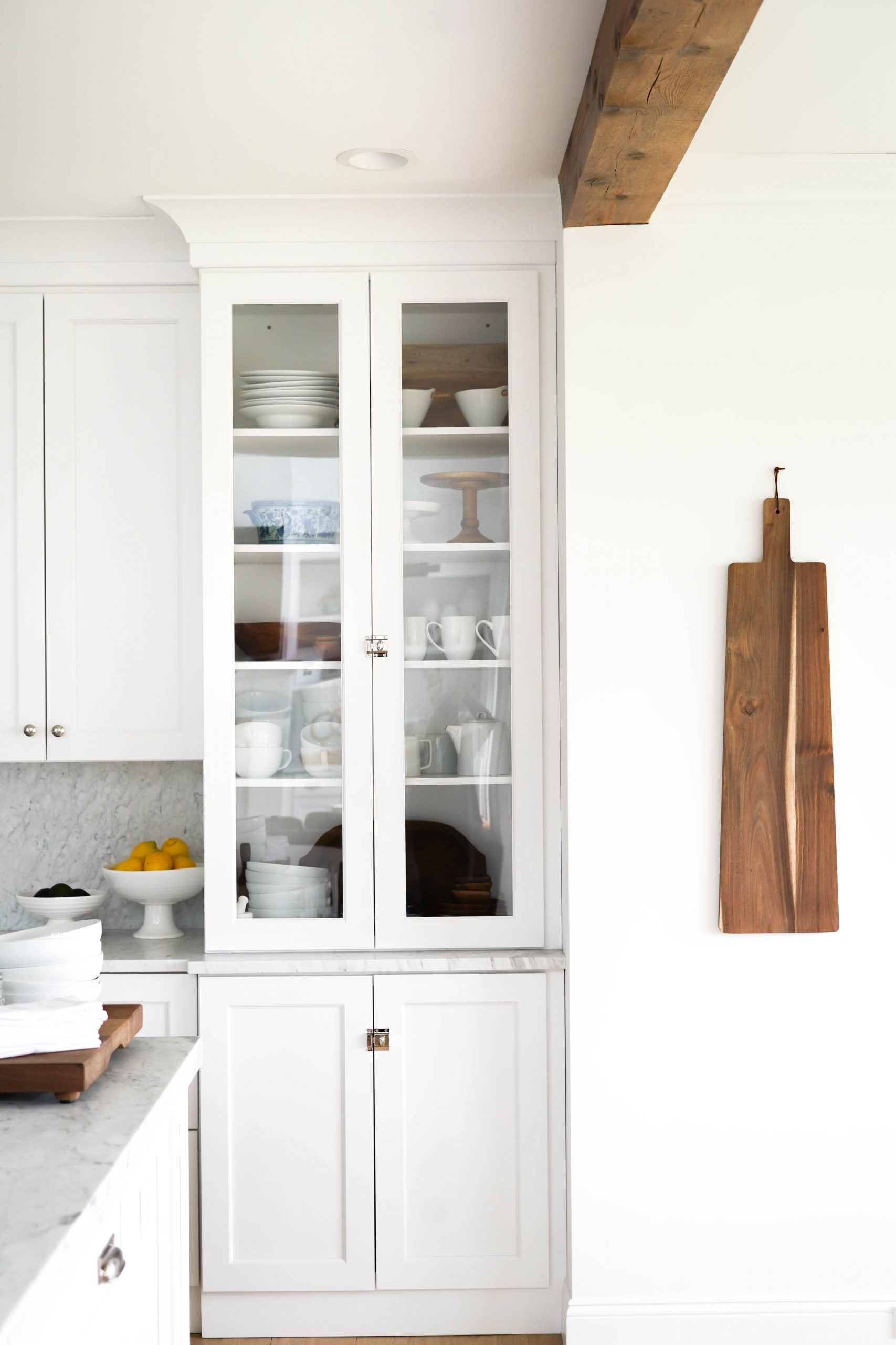
I always wanted a glass hutch to display our whiteware and special serving dishes. Given the design of our kitchen, it made the most sense to include this hutch as a continuation of our cabinetry. We had it built deeper than our standard cabinets so it would stand out. Once again, we chose a very tall cabinet door that spans all the way from the countertop to the ceiling. This glass hutch is filled with a mix of everyday dishes, antiques and family heirlooms.
LIGHTING
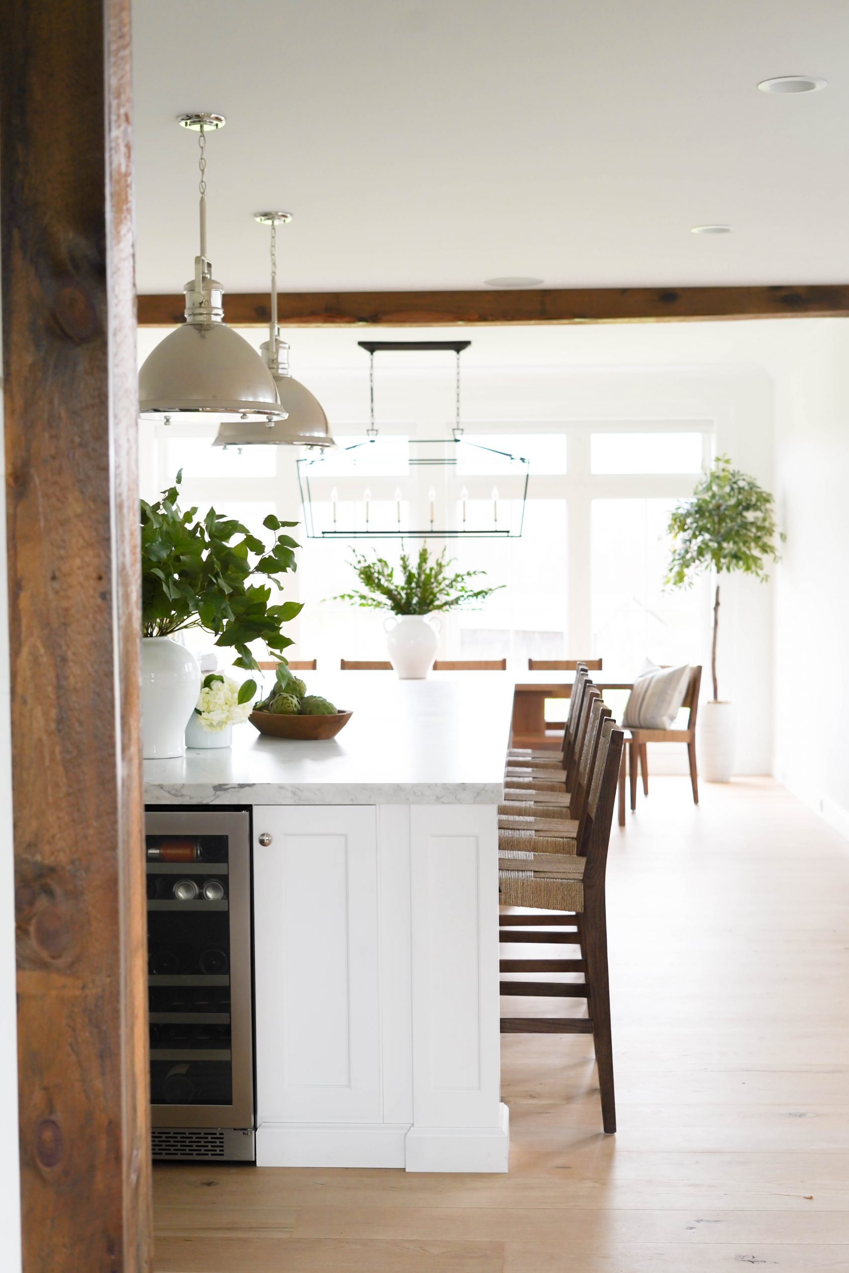
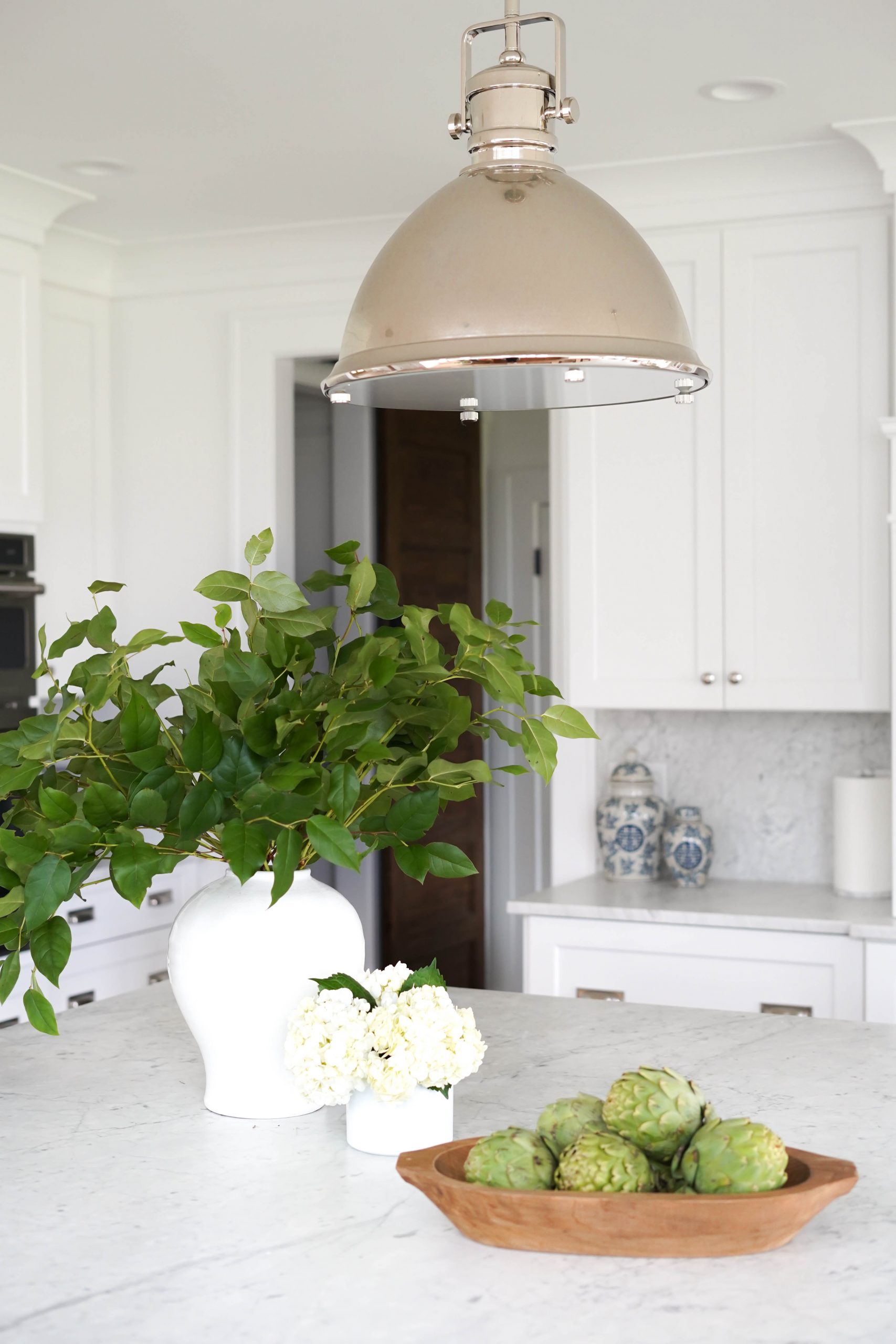
For over our island, we chose dome style pendants. I had my eye on a more expensive style but was lucky to find this affordable option instead! These pendants come in several finishes and sizes – we have the 19″ in polished nickel. They are stunning in person and look great as a pair suspended over the island!
We selected a linear chandelier to place above our dining room table. It’s open metal frame reminds me of an oversized lantern. Despite it’s size, it has a low profile design that compliments (and doesn’t block!) our view out the back windows. It has a simple row of candelabras that floats perfectly above our table. This fixture comes in several different finishes and sizes. We have the large size in aged iron. If you’re looking for something similar but more affordable, I linked two additional options below!
Similar more affordable option!
APPLIANCES
James and I did a lot of research when it came to selecting appliances. The decision we struggled with most was whether or not the appliances would be the same brand. The answer we eventually came to was NO.
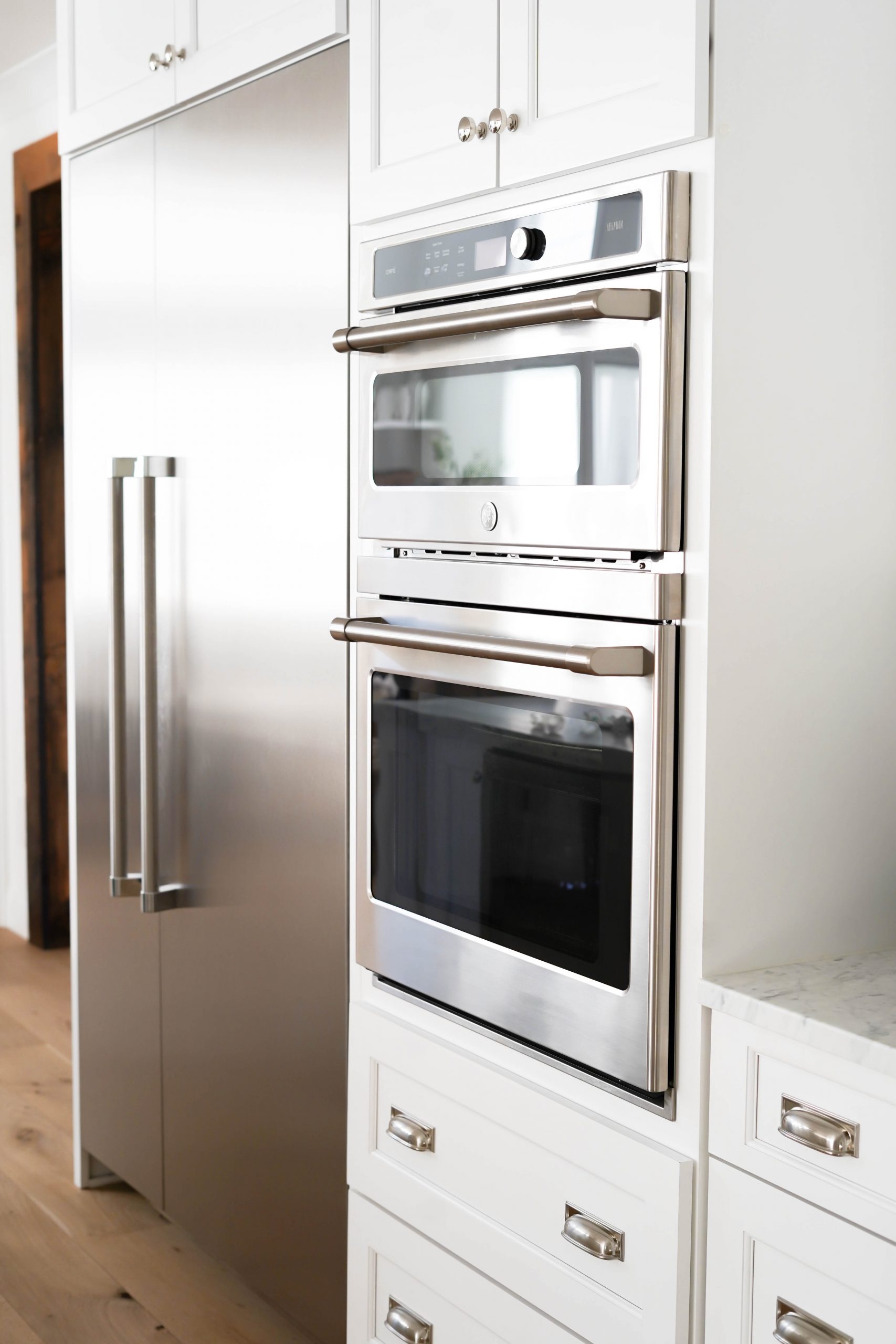
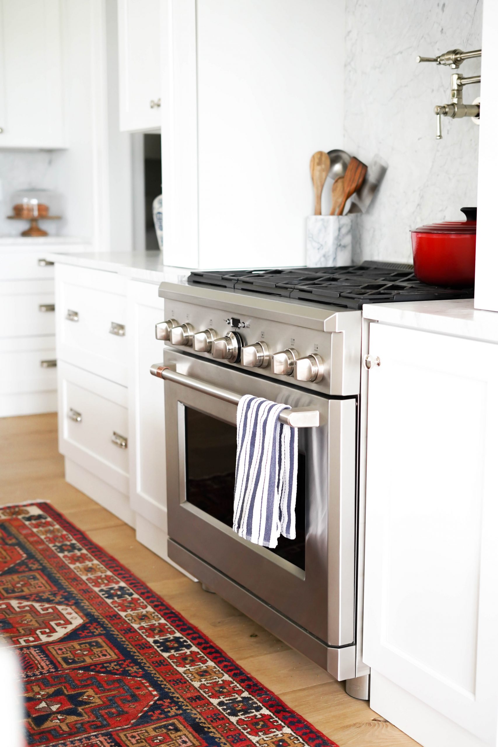
We ended up choosing a GE Cafe Gas Range and Double Electric Wall Oven. GE Cafe is GE’s newest line of professional style appliances. They’re designed and styled for a more industrial kitchen look.
Why we chose 36″ range…
I’m often asked why we chose a 36″ range over a 48″ and if we are happy with our decision. The decision came down to what seemed most practical for us and entertaining. I love the look of a 48″ range, but it just didn’t seem necessary for our cooking needs. Even my husband – who I would consider an AMAZING chef – said a 36″ was more than sufficient. The other thing I love about the 36″ is the size of the oven. You get a very wide 36″ oven, rather than two smaller ovens – a 30″ and 18″ (that come with a standard 48″ range.)
I couldn’t help but think of previously hosted holidays and all the appetizers, side dishes and main courses that would need to be cooked/heated up all at once. Our final decision was to go with the 36″ range and matching 30″ wall oven. Having all this extra oven space for entertaining is what sold us!
We mixed our GE Cafe appliances with a Thermador Refrigerator Column, Freezer Column and Dishwasher. What I love about the Thermador appliances is that they have no visible logo – so they blend nicely with the other stainless appliances we chose throughout the kitchen. All the Thermador appliances are built-in and panel ready. We loved the look of these appliances in our kitchen, so we chose to leave them exposed!
SINK
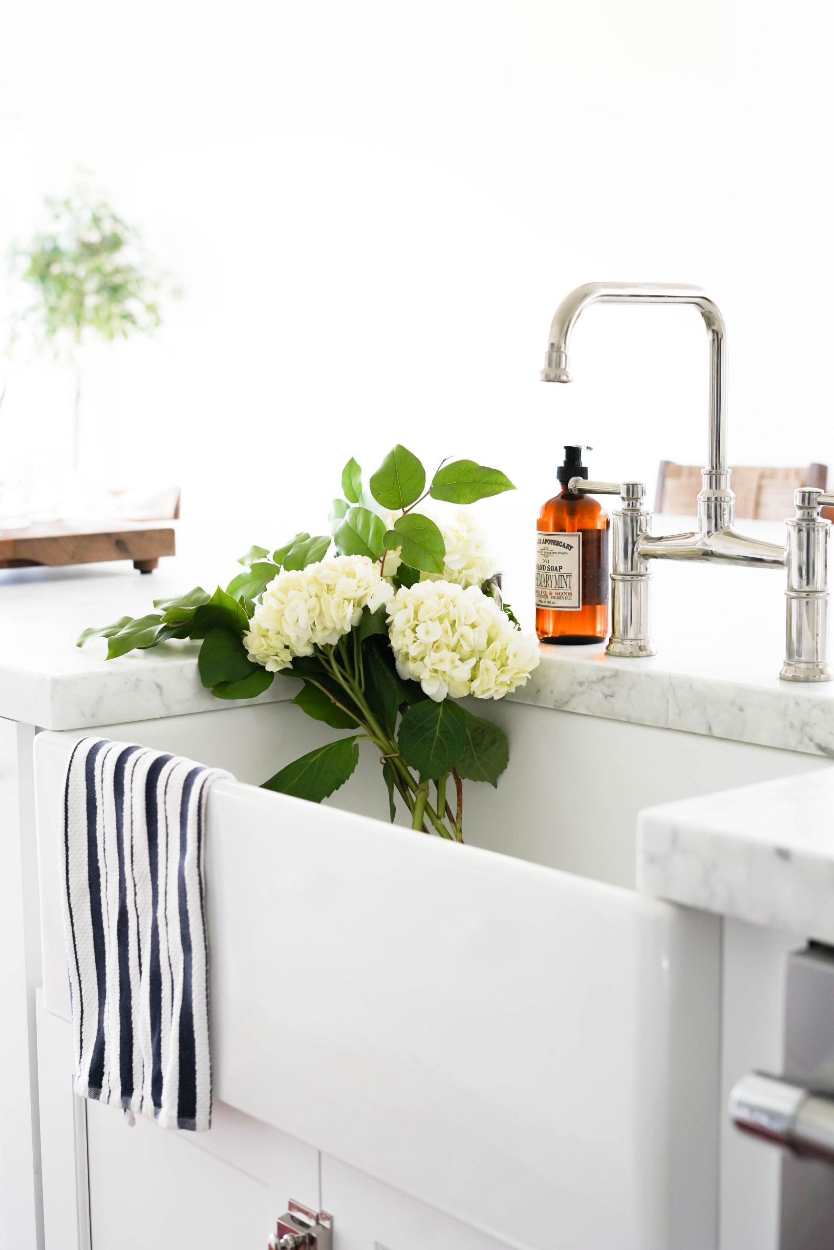
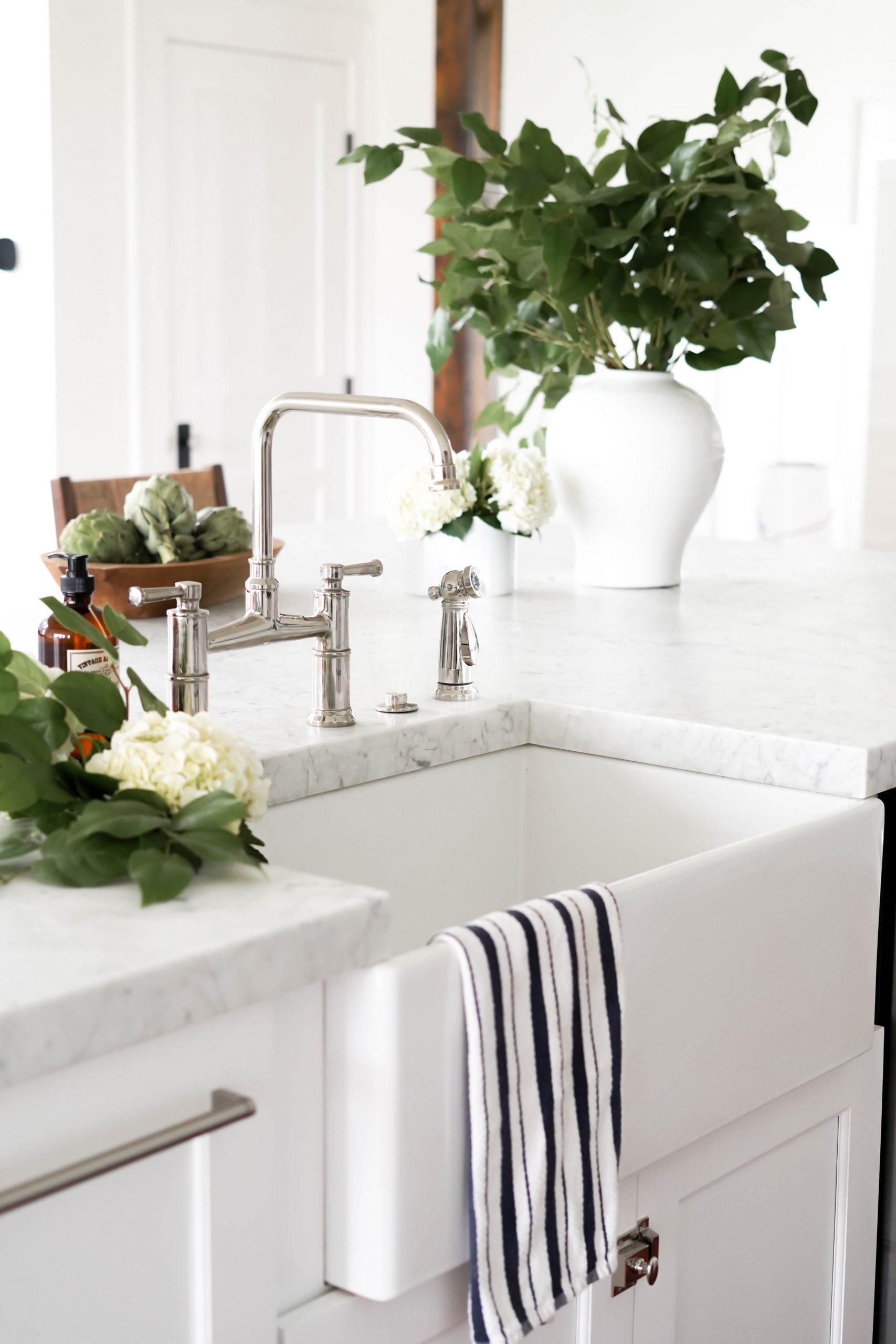
Choosing a sink was a no-brainer for us…we always knew we wanted a white farmhouse sink! I love the size and how deep it is for washing dishes.
Our faucet and pot filer are both by Brizo. We chose a bridge style kitchen faucet and side spray with matching soap dispenser in polished nickel to match all the other hardware in the kitchen. Our pot filler is part of the same Brizo collection. If you’re on the fence about a pot filler – do it! I love the way it looks and it’s proven to come in handy – especially if you have a heavy cookware set like we do! However I would not go with this brand – it’s beautiful but has not held up very well.
RUG
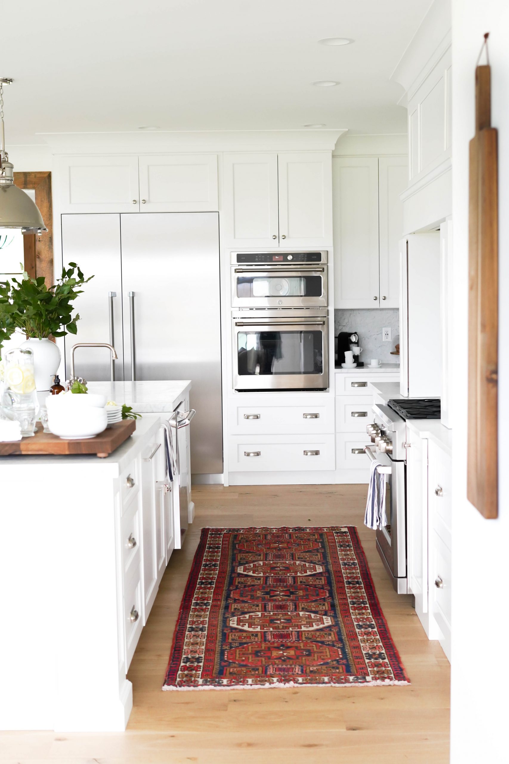
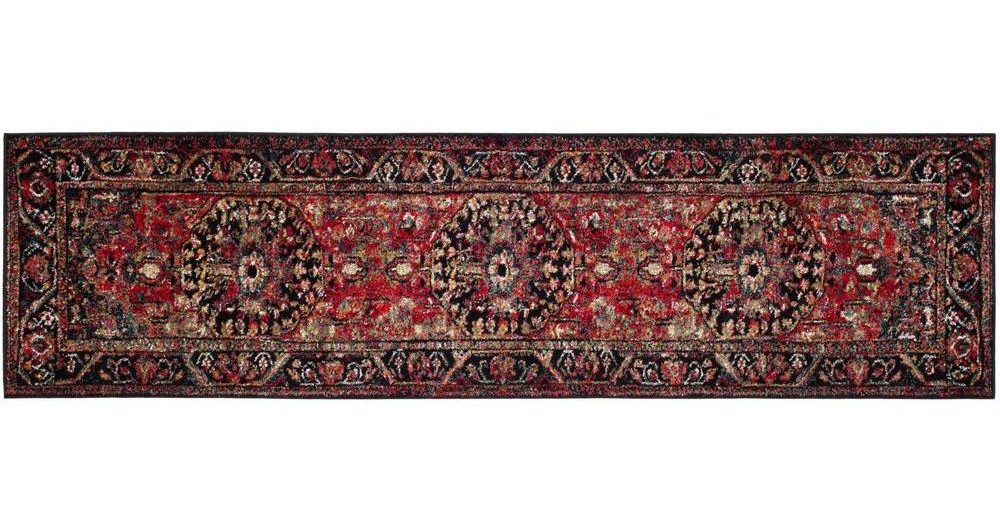
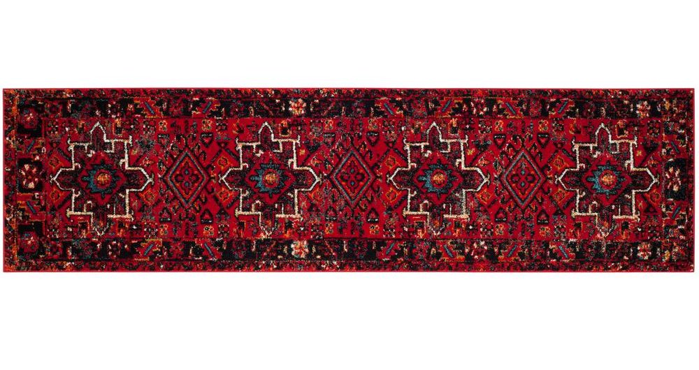
We recently added this bold Turkish runner to our kitchen and I could not be more in love! It added so much character and warmth to the space. I was lucky enough to find the perfect color and style at this Etsy shop. It may take some time to find the perfect vintage runner for your kitchen, but I found that Etsy had the biggest and best selection.
I also linked two NEW rug options below (not vintage) that are the same style/color as mine (they’re also much more affordable!)
FURNITURE
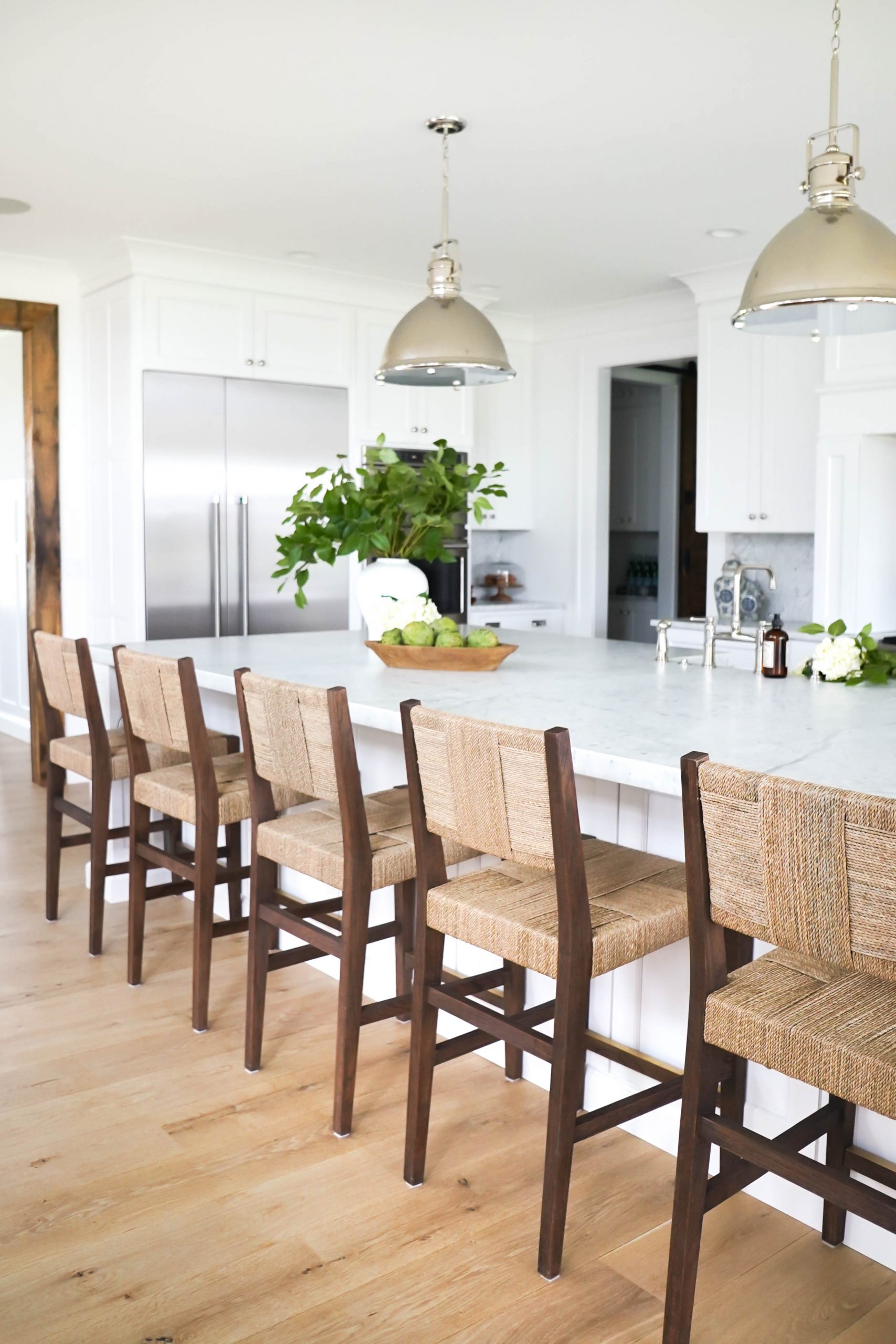
In the kitchen we added 5 white oak counter stools with a woven seagrass seat and back. They are Dutch-influenced with an emphasis on natural elements and traditional style. These stools are another beautiful and very similar option. We used the matching style side chairs (similar style) on one side of our dining room table.
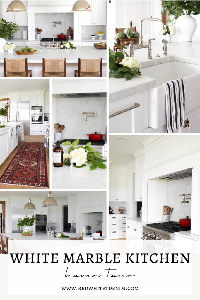
LIKE THIS WHITE MARBLE KITCHEN POST? PIN IT!
SAVE IT ON PINTEREST BY CLICKING THE ‘SAVE’ BUTTON ON ONE OF THE PHOTOS BELOW!


hi
KITCHEN VIDEO TOUR
WATCH HERE I found out ..so thank you
What a great post! We are in the process of designing our kitchen for our new build and love looking at your kitchen as inspiration. Do you happen to down the name of the sealant that was used to protect your marble (the one with the 15 year warranty)? Thanks!
I don’t, but we got them at Pistritto Marble in CT.
I’m wondering what the name of the sealant is too!
I’m unsure! I got them from Pistritto Marvle in East Hartford Ct.
What a fabulous kitchen! Thank you for sharing! I’m about to order five of those RH stools, are you still loving them?
Did you ever get a response on this? I’m ready to purchase as well and wondering the same thing.
Can you share the width of your miter on your island? Is it two inches?
Yes 2 inches!